The project is now finished!
I'm really happy with the end results soooo this blog is now closed
xxxx
Band Website
Thursday, December 17, 2009
Closing Post
Posted by LATYMERMEDIA at 7:39 AM 0 comments
Evaluation Question 1
Here's parts of Question 1 that we filmed. I think this part represents my contribution to this question well. The rest of the evaluation footage for Question 1 can be found on the group blog. Click Here for Question 1.
I think our answer to question 1 went well, although it was a little long. I think I made a good contribution to it and I think I answered the question, which is illustrated above. However, I think I could have got to the point a little quicker, as I did tend to ramble on a bit. Overall I think we covered everything that we had planned to say.
Posted by LATYMERMEDIA at 5:13 AM 0 comments
Labels: Evaluation, Evaluation: Question 1
Evaluation Question 2
Here's Question 2 of the evaluation:
I think this question went quite well. We spoke about everything that we wanted to say, however I was less comfortable with this question as Mel had worked on it more than me as we had split the planning of the questions between us. Therefore I don't think I spoke as much as Mel, but I think I did still manage to make a good contribution and I was able to bounce of Mel's comments.
Posted by LATYMERMEDIA at 5:13 AM 0 comments
Labels: Evaluation, Evaluation: Question 2
Evaluation Question 3
Here's one of the parts of Question 3. I think this part demonstrates my contribution to the question well. Click Here for the rest of Question 3.
For Question 3, I think we spoke about the audience well and who we were intending on targetting. We relfected and analysed the feedback that we had got and showed that we found it really useful. I think we answered this question well and spoke in depth about the comments that we had receieved about our three products. I think I definately contributed well to this question and I found it easier as it was the question that I had planned.
Posted by LATYMERMEDIA at 5:12 AM 0 comments
Labels: Evaluation, Evaluation: Question 3
Evulation Question 4
Here's the answer to Question 4:
I think we answered this question well, analysing all the technologies that we have used throughout this project. However one thing I think we could have improved on is that we could have mentioned technologies that we haven't used, such as a MAC, and explained why and gave our opinions on this.
Posted by LATYMERMEDIA at 5:12 AM 0 comments
Labels: Evaluation, Evaluation: Question 4
Wednesday, December 16, 2009
Planning for the Evaluation
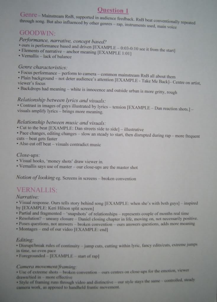
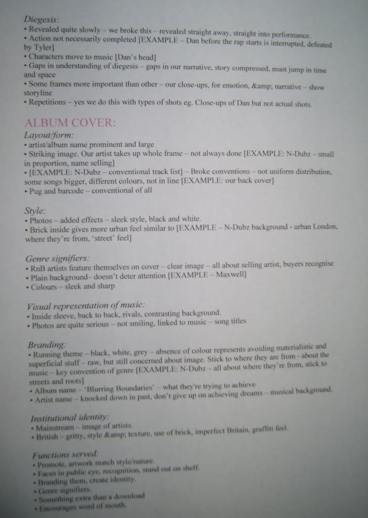
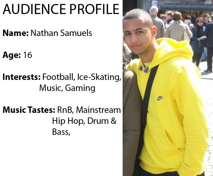
When planning for the evaluation, Mel and I did a rough plan for all four questions. However, to use our time more efficiently, we decided to split the questions between us where we would go into more detail. I did Question 1 and Question 3. Here are the notes that I made for both questions:
Question 1
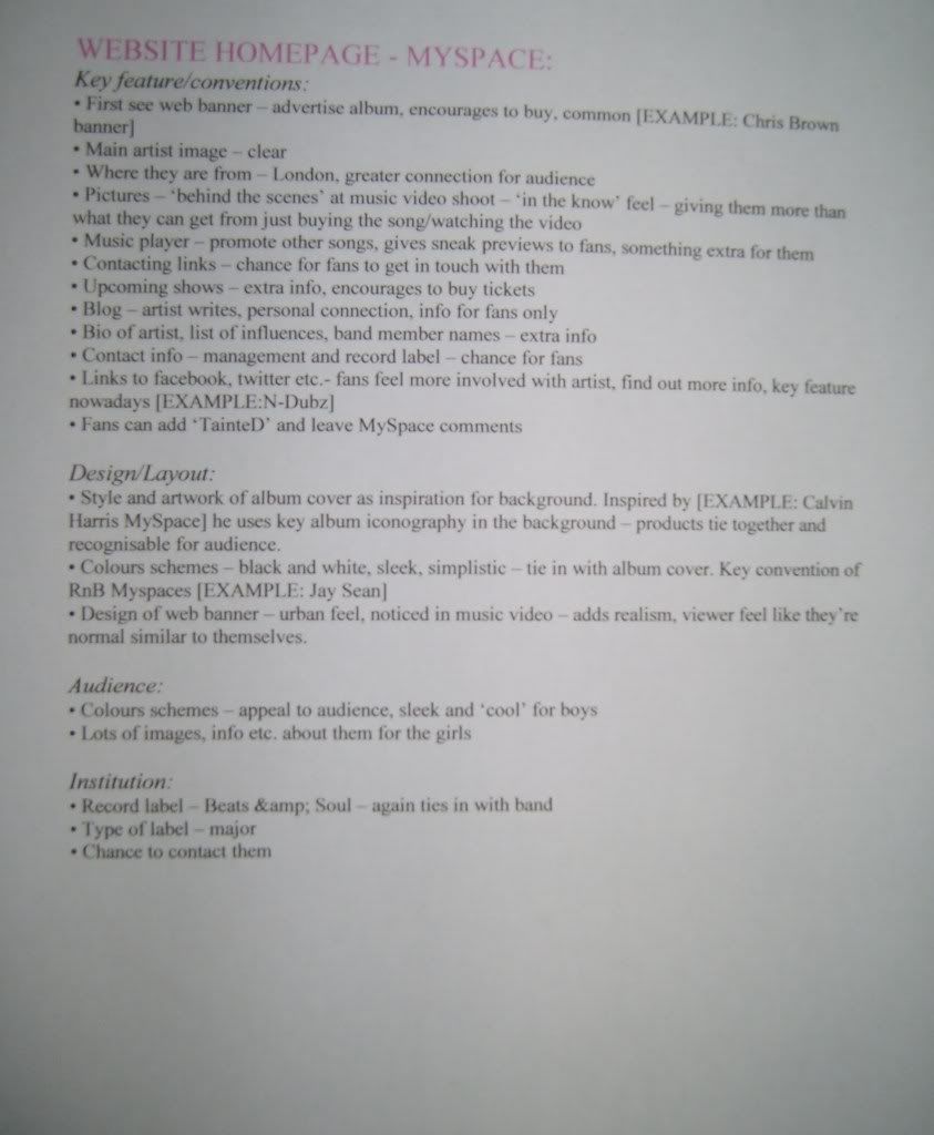
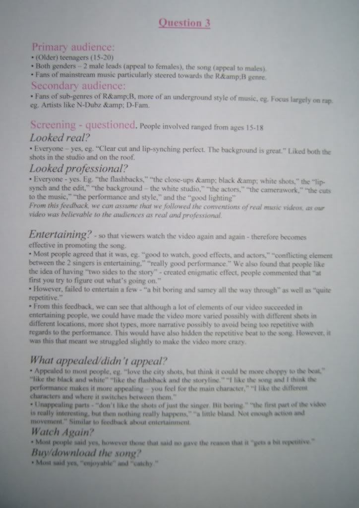
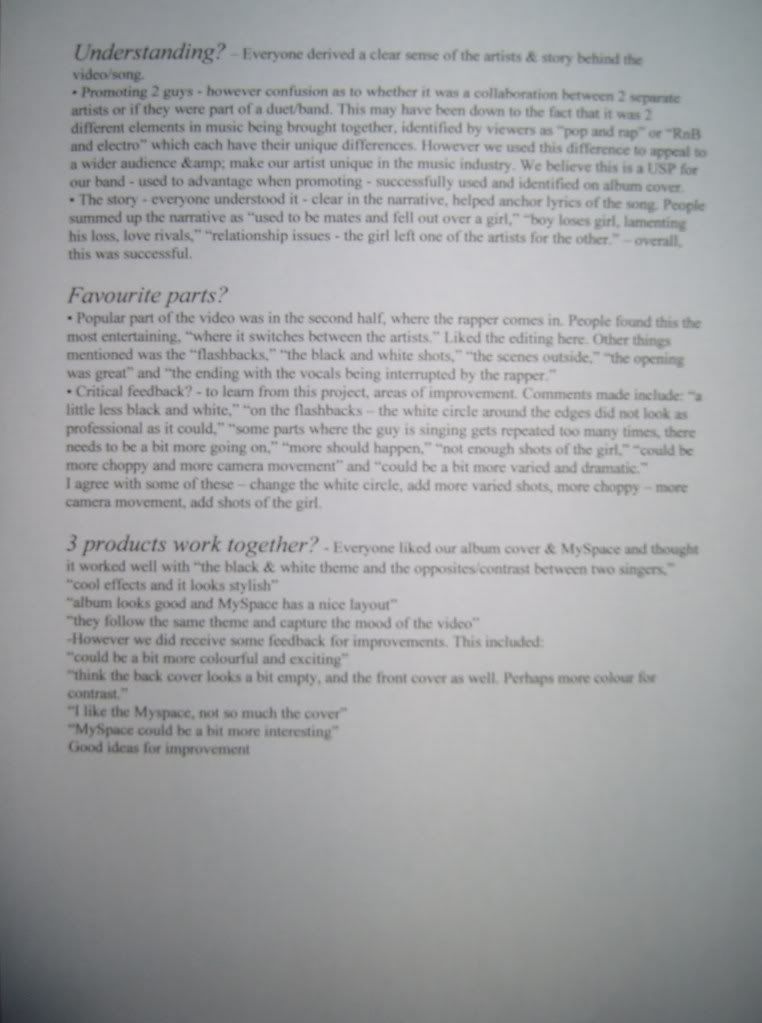
Question 3
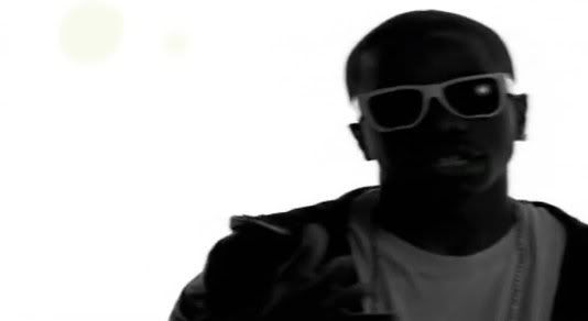
Jason Derulo - Watcha Say
Tinchy Stryder Ft Taio Cruz 'Take Me Back':
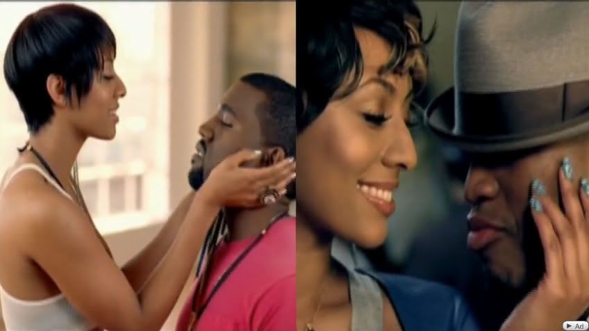
Inspiration taken from Keri Hilson - Knock You Down:
Inspiration taken from James Morrison Ft Nelly Furtado - Broken strings:
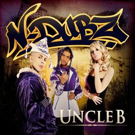
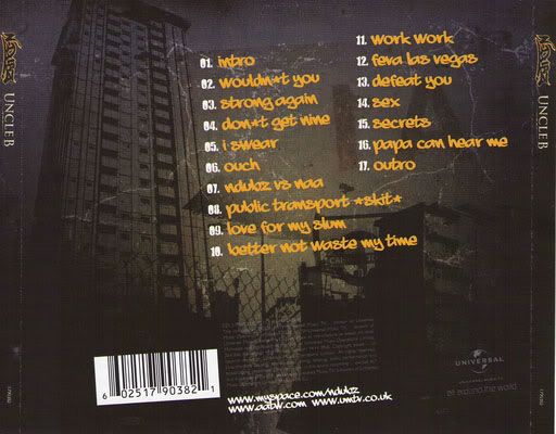
N-Dubz ‘Uncle B’ Album Cover:
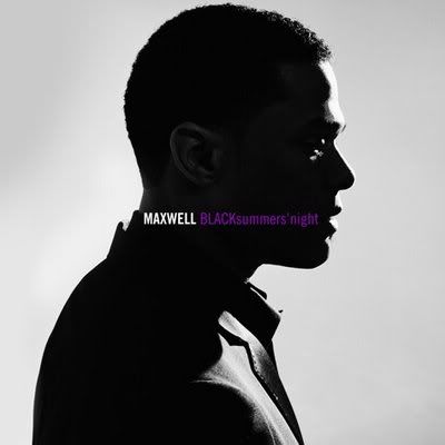
Maxwell ‘BLACK Summer’s Night’ Album cover:
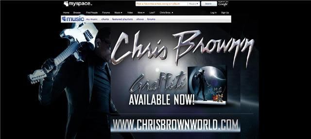
Chris Brown MySpace Banner:
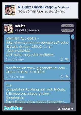
N-Dubz Twitter Widget as well as a link to their official Facebook page:
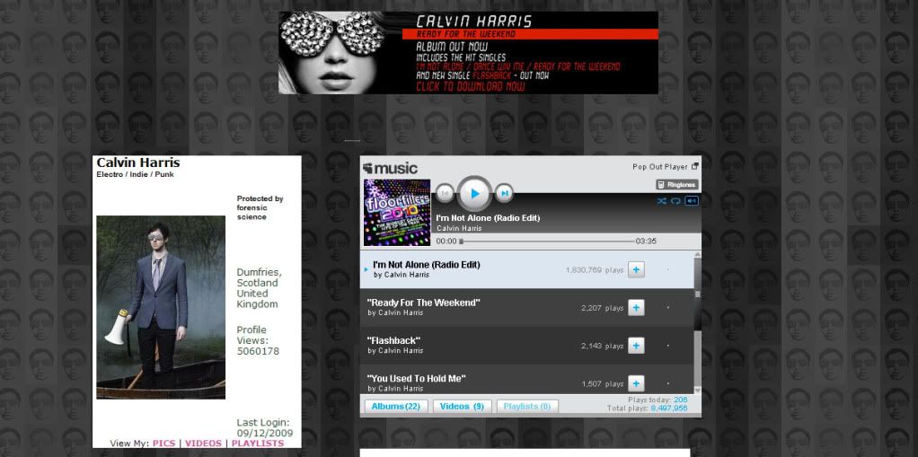
Calvin Harris MySpace – Background links to album artwork:
http://www.myspace.com/calvinharristv
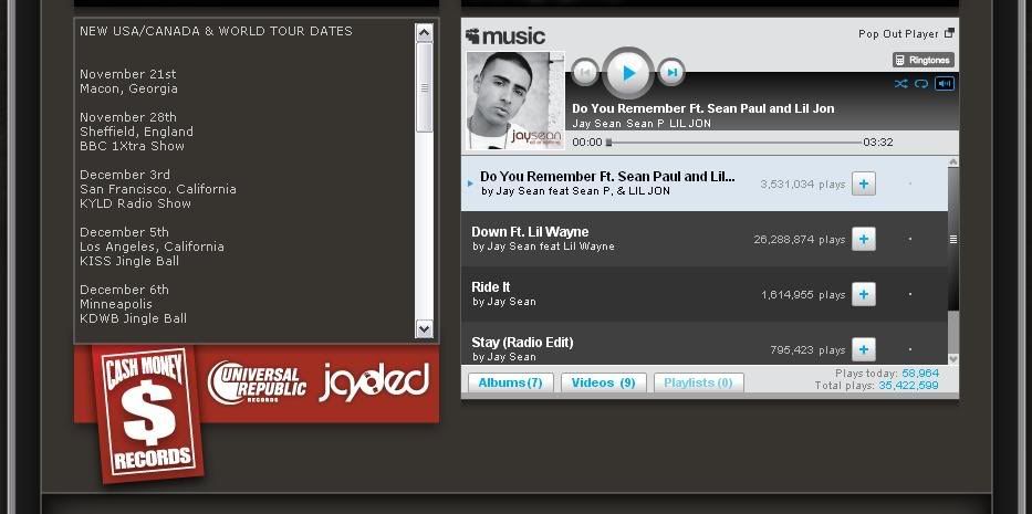
Jay Sean MySpace - Style/Colours are conventions:
http://www.myspace.com/jaysean
Posted by LATYMERMEDIA at 7:10 AM 0 comments
Labels: Evaluation, Planning
Monday, December 14, 2009
Music Video
Here's our final music video. I'm really happy with the results and I think we've achieved the effect that we wanted. Although in hindsight there are a couple of things I would change, such as more varied shots eg. some of the girl, more movement and choppy editing etc. I think it still works really well as it is. We've cleary shown the contrast and division in the two artists, as well as showing that these two genres of music work well together. We've also got accross the emotion in the song that we heard from the first time we listened to it. So overall, I'm really happy with it.
Posted by LATYMERMEDIA at 6:19 AM 0 comments
Labels: Final Video, Production, Reflections
MySpace
Here's our band website. We chose to do a MySpace page. I think its turned out well and the design ties in with our proucts well, meaning it all works together as a promotional package. I think we could have been a little more experimental with the design/layout, however I also think it's simplicity works well with our artists.
www.myspace.com/tainted09
Posted by LATYMERMEDIA at 5:21 AM 0 comments
Labels: MySpace, Production, Reflections
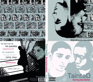
Album Cover
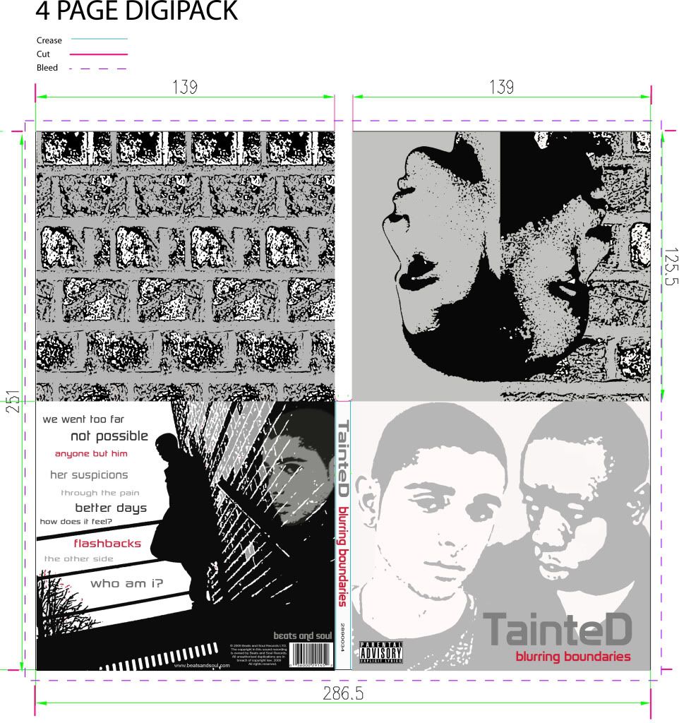
Here's our final digipack. I think the album cover, both the front and back, as well as the inside sleeve and CD back, all work well together. The design runs through the digipack and the style all relates well to the other proudcts we have made.
Posted by LATYMERMEDIA at 5:20 AM 0 comments
Labels: Album Covers, Production, Reflections
Thursday, December 10, 2009
Evaluation
We had our evaluation yesterday where we filmed our responses to the four questions. We prepared notes which are on the group blog. We split it so that we each did the notes for two questions and we then lead these questions when we actually filmed it. I did question 1 (conventions) and question 3 (audience).
During the filming of the evaluation, we were a little nervous because it was something really different, but overall I think it went well. From what I can remember, we covered everything that we wanted to and we didn't really have any problems with how much we each said. I think it was a roughly 50/50 split in the amount that we each spoke and it was easy to bounce off each other because there were only two of us. Soo hopefully it was ok.
Posted by LATYMERMEDIA at 2:47 AM 0 comments
Labels: Evaluation, Reflections
Tuesday, December 8, 2009
Audience Feedback
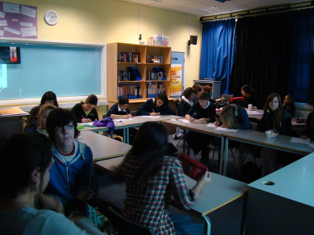
We had a screening today where we showed our target audience the three products that we have made. They gave us feedback that meant we could see if we were targeting the right audience, as well as finding out some improvements that could be made and seeing what effect or impact the three products had on the audience.
Click here for all the feedback

Everyone said it looked like a real music video and looked professional. Reasons for these were:
• Lipsynching
• The backgrounds – the studio and outside
• Close-ups
• Black and white
• Flashbacks
• The actors
• The camerawork
• Cuts to the music
• The performance
• Lighting
Overall, we got really positive feedback about whether it was believable as a real music video. This is really good as it shows that we have followed and used the conventions of real music videos. From this feedback, I think that the locations (white studio and outside), actors (performance, lip-synch, attitude etc.), lighting and the use of black and white were the strongest elements of our video. This is really good because these are the parts that our video centres around.
Music videos should be entertaining and this is so that people watch the video again and again - when we asked people if they'd watch it again, most said yes, and when asked if they'd download/buy the song, most said yes as it 'enjoyable' and 'catchy.' Entertainment is also important for word of mouth as it will encourage people to talk about it. This optimizes the amount that we are able to promote the song. When we asked people if they found it entertaining, most people said yes (18 out of 22). The reasons they gave were:
• Good actors/Good Performance
• Like the conflicting element between the two singers/two sides to the story
• Liked the black and white
• Liked the setting
However, four people did say no and the reasons they gave were that it was a bit repretitive and stays the same all the way through. I do agree that the start of the video can be abit repetitive, but we wanted this strong performance at the start, and then its disrupted by the rapper. So I don't agree that it stays the same all the way through. There is a point of change, and this interrupts Daniel's performance, representing the fact that Tyler, the rapper, interrupts and disrupts Daniel's life. We also have the narrative elements throughout the video.
Appeal is also important. We wanted to see if the music video appealed to our audience to ensure that we were targetting the right audience. I think this was fairly successful as we did appeal to most people. The parts that appealed to them were:
• The outside city shots
• The black and white
• The flashback and storyline – interesting narrative
• Performance – you feel for the main character
• The different characters and the way it switches between them
A couple were unsure and they said that they just didn’t like the shots of just the singer as they found it a bit boring. Someone also said that they found the first part of the video really interesting but then found that nothing really happens.
We also had a few people say no (4 people.) Their reasons were that they found it a little bland with not enough action and movement and therefore found it a bit boring.
I can see why they said this; however we were going for this effect at the start. We found that too much movement and choppy editing just didn’t fit with the song and we wanted to focus mainly on the character’s emotion, therefore we made it look very simple, just concentrating on the guys, how they are feeling and what they are saying.
Understanding of the video/song is also important, although a lack of understanding the first time you watch it can also have an enigmatic effect, making you want to watch it again. When we asked our audience if they understood the narrative behind our music video, everyone said yes. This was really good as we only had a couple of shots of narrative in our music video, but we managed to get accross the story in this short amount of time. Most people also understood that it was a band/duo, however some thought it was two artists collaborating on a track. This is probably due to the fact that it is a combination of such different genres of music, however we thought this is what would make our band different and can be their unique selling point.
The appeal of the artists is also important for fans. We had to consider this when we chose our actors and I think we made the right decisions because people said:
• Young and ‘cool.’ Appeal to teenage guys.
• Good emotion – very convincing
• The black guy is likeable – smug and cocky. The main guy is so cute, I feel sorry for him
• They are so different – both physically and their attitudes.
• They are emotional – it’s good - you feel sorry for the guy singing who’s lost his love.
• Good looking
We also asked people for their criticisms as this is important to find out what we can improve on and think about what we would change.
Some criticisms people made were:
• A little less black and white
• Shots up against the wall look a bit over the top/cheesey
• The white circle around the shots on the flashbacks did not look as professional as it could.
• Some parts where the singer gets repeated too many times - needs to be a bit more going on.
• Not enough shots of the girl
• Could be more choppy and more camera movement - could be a bit more varied and dramatic
I agree with most of these points. We did try to do some shots in colour, such as the narrative but we decided that this just didn’t work and didn’t look right so we decided to put it all in black and white. I also think the white circle on the flashbacks do not look as professional as they could – I don’t think they achieved that ‘dreamy’ affect that we wanted. I also think that it is a good idea to add more shots of the girl – this will also add variety. We did try to make it more choppy with editing but this was difficult with the song as its quite slow and we didn’t think that it would have as much emotional impact.
We also wanted some feedback on the other products that we made (the digipak and the MySpace). We asked people if they liked them and if they thought all 3 products tied together well.
They liked the:
• Running colour schemes - Black/White/Grey
• The opposites/contrast between the artists.
• “Cool effects and it looks stylish.”
• “Album looks good and MySpace has a nice layout”
• “They follow the same theme and capture the mood of the video”
Some improvements were:
• Could be a bit more colourful and exciting
• Think the back cover looks a bit empty, and the front cover as well. Perhaps more colour for contrast.
• MySpace could be a bit more interesting.
I can see why people may have wanted more colour used in the products; however we found that the absence of colour was a convention of the genre, particularly with male artists. We did try to add some colour that we thought would still tie in, such as the red used on the album cover however we didn’t want to use too much.
Overall, this feedback session was really helpful and we got some useful information about our audience and how they feel about the products that we have made.
Posted by LATYMERMEDIA at 1:21 AM 0 comments
Labels: Audience, Evaluation, Feedback, Reflections
