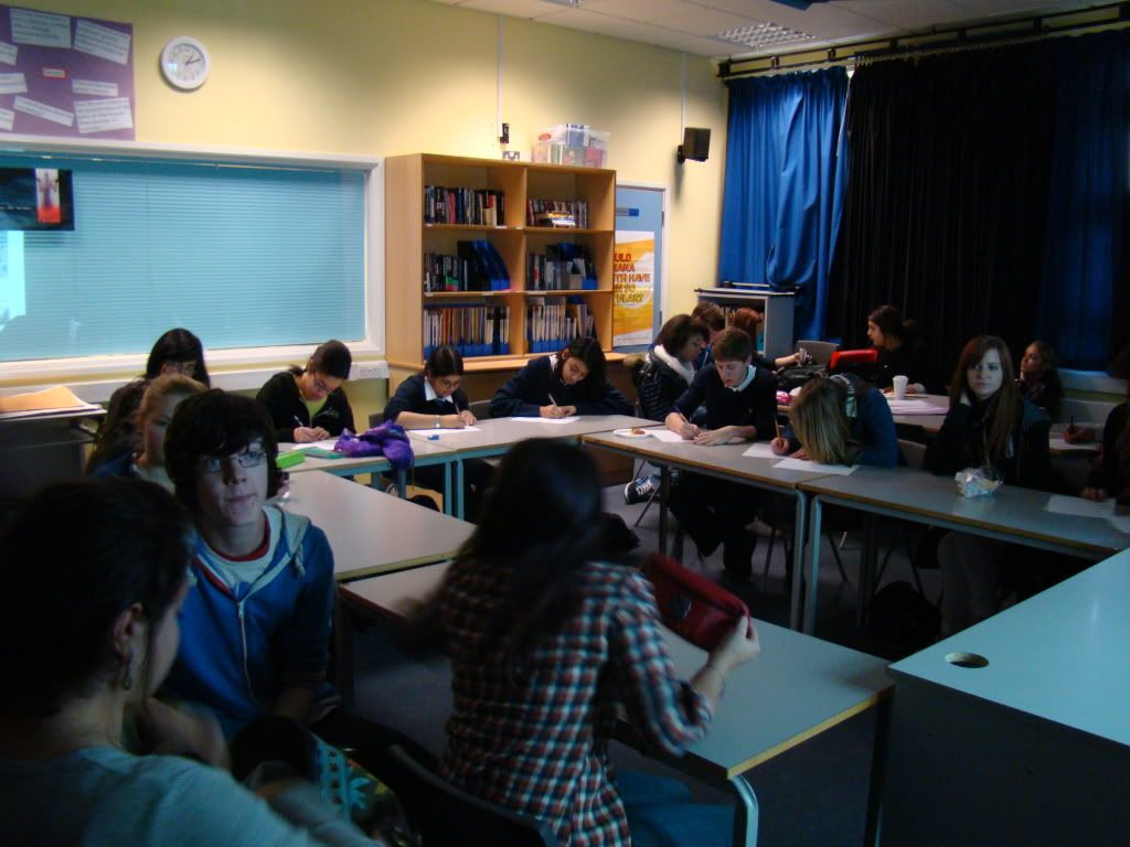
We had a screening today where we showed our target audience the three products that we have made. They gave us feedback that meant we could see if we were targeting the right audience, as well as finding out some improvements that could be made and seeing what effect or impact the three products had on the audience.
Click here for all the feedback

Everyone said it looked like a real music video and looked professional. Reasons for these were:
• Lipsynching
• The backgrounds – the studio and outside
• Close-ups
• Black and white
• Flashbacks
• The actors
• The camerawork
• Cuts to the music
• The performance
• Lighting
Overall, we got really positive feedback about whether it was believable as a real music video. This is really good as it shows that we have followed and used the conventions of real music videos. From this feedback, I think that the locations (white studio and outside), actors (performance, lip-synch, attitude etc.), lighting and the use of black and white were the strongest elements of our video. This is really good because these are the parts that our video centres around.
Music videos should be entertaining and this is so that people watch the video again and again - when we asked people if they'd watch it again, most said yes, and when asked if they'd download/buy the song, most said yes as it 'enjoyable' and 'catchy.' Entertainment is also important for word of mouth as it will encourage people to talk about it. This optimizes the amount that we are able to promote the song. When we asked people if they found it entertaining, most people said yes (18 out of 22). The reasons they gave were:
• Good actors/Good Performance
• Like the conflicting element between the two singers/two sides to the story
• Liked the black and white
• Liked the setting
However, four people did say no and the reasons they gave were that it was a bit repretitive and stays the same all the way through. I do agree that the start of the video can be abit repetitive, but we wanted this strong performance at the start, and then its disrupted by the rapper. So I don't agree that it stays the same all the way through. There is a point of change, and this interrupts Daniel's performance, representing the fact that Tyler, the rapper, interrupts and disrupts Daniel's life. We also have the narrative elements throughout the video.
Appeal is also important. We wanted to see if the music video appealed to our audience to ensure that we were targetting the right audience. I think this was fairly successful as we did appeal to most people. The parts that appealed to them were:
• The outside city shots
• The black and white
• The flashback and storyline – interesting narrative
• Performance – you feel for the main character
• The different characters and the way it switches between them
A couple were unsure and they said that they just didn’t like the shots of just the singer as they found it a bit boring. Someone also said that they found the first part of the video really interesting but then found that nothing really happens.
We also had a few people say no (4 people.) Their reasons were that they found it a little bland with not enough action and movement and therefore found it a bit boring.
I can see why they said this; however we were going for this effect at the start. We found that too much movement and choppy editing just didn’t fit with the song and we wanted to focus mainly on the character’s emotion, therefore we made it look very simple, just concentrating on the guys, how they are feeling and what they are saying.
Understanding of the video/song is also important, although a lack of understanding the first time you watch it can also have an enigmatic effect, making you want to watch it again. When we asked our audience if they understood the narrative behind our music video, everyone said yes. This was really good as we only had a couple of shots of narrative in our music video, but we managed to get accross the story in this short amount of time. Most people also understood that it was a band/duo, however some thought it was two artists collaborating on a track. This is probably due to the fact that it is a combination of such different genres of music, however we thought this is what would make our band different and can be their unique selling point.
The appeal of the artists is also important for fans. We had to consider this when we chose our actors and I think we made the right decisions because people said:
• Young and ‘cool.’ Appeal to teenage guys.
• Good emotion – very convincing
• The black guy is likeable – smug and cocky. The main guy is so cute, I feel sorry for him
• They are so different – both physically and their attitudes.
• They are emotional – it’s good - you feel sorry for the guy singing who’s lost his love.
• Good looking
We also asked people for their criticisms as this is important to find out what we can improve on and think about what we would change.
Some criticisms people made were:
• A little less black and white
• Shots up against the wall look a bit over the top/cheesey
• The white circle around the shots on the flashbacks did not look as professional as it could.
• Some parts where the singer gets repeated too many times - needs to be a bit more going on.
• Not enough shots of the girl
• Could be more choppy and more camera movement - could be a bit more varied and dramatic
I agree with most of these points. We did try to do some shots in colour, such as the narrative but we decided that this just didn’t work and didn’t look right so we decided to put it all in black and white. I also think the white circle on the flashbacks do not look as professional as they could – I don’t think they achieved that ‘dreamy’ affect that we wanted. I also think that it is a good idea to add more shots of the girl – this will also add variety. We did try to make it more choppy with editing but this was difficult with the song as its quite slow and we didn’t think that it would have as much emotional impact.
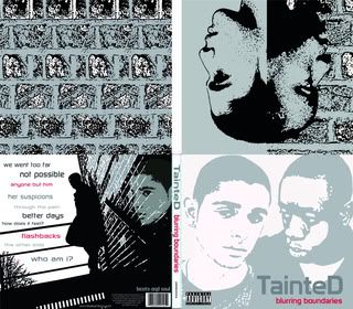
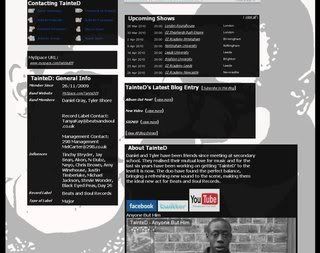
We also wanted some feedback on the other products that we made (the digipak and the MySpace). We asked people if they liked them and if they thought all 3 products tied together well.
They liked the:
• Running colour schemes - Black/White/Grey
• The opposites/contrast between the artists.
• “Cool effects and it looks stylish.”
• “Album looks good and MySpace has a nice layout”
• “They follow the same theme and capture the mood of the video”
Some improvements were:
• Could be a bit more colourful and exciting
• Think the back cover looks a bit empty, and the front cover as well. Perhaps more colour for contrast.
• MySpace could be a bit more interesting.
I can see why people may have wanted more colour used in the products; however we found that the absence of colour was a convention of the genre, particularly with male artists. We did try to add some colour that we thought would still tie in, such as the red used on the album cover however we didn’t want to use too much.
Overall, this feedback session was really helpful and we got some useful information about our audience and how they feel about the products that we have made.
Band Website
Tuesday, December 8, 2009
Audience Feedback
Posted by LATYMERMEDIA at 1:21 AM
Labels: Audience, Evaluation, Feedback, Reflections
Subscribe to:
Post Comments (Atom)


0 comments:
Post a Comment