
We had our main shoot yesterday which went pretty well, but after capturing the footage today, we have noticed that we may need to re-shoot quite a bit due to problems such as bad framing, things in shot that we don’t want to be there, not much movement etc. We also need more close-ups of both guys.
Our shoot however did go very smoothly. Both actors turned up on time and were well prepared with their lip synching. We had planned the day focussing mainly on the main artist who was with us for 10 hours (8am-6pm) which was pretty tiring for him. Our next actor arrived at 4 and was with us for two hours. We had only planned to do the shots of the two of them together in this time, however when we were left with spare time at the end, we decided to do some unplanned shots of our second artist in an outside location. Therefore the shoot was successful; however we need to look back over the footage in detail to decide what shots we need to shoot again and what extra shots we can get.
Here are some photos from the shoot:


Album Cover

Band Website
Monday, October 19, 2009
The Shoot
Thursday, October 15, 2009
Planning…
This week we have been planning our shoot that is going to take place this Sunday. We visited the location that we want to use on Monday and did a location reccy to check its suitability. We liked the way that we could film in two different locations (outside and inside) and we have therefore developed this further and are going to make this contrast a main part of our video. We will place one artist in the outside, urban area and the other will be contrasted in the stark white room inside. This will distinguish them as different artists and will emphasise the conflict between them that we hear in this song.
As planning for the shoot, we gave been working on producing storyboards for tricky sequences in the video to ensure the shots work together, as well as a shooting schedule for the day and a call sheet for our actors.
As well as this planning, we have been developing our ideas for the video. We have decided that we want the conflict to be a main theme in the video and this could be shown through a build up to a confrontation between the two artists at the end of the video. We have also been trying to decide if we want to base our video on performance with narrative or with concept. Our concept ideas are the fact that we are demonstrating a realistic view on human relationships and society which can be shown through the contrasts in location and costume to demonstrate something like rich vs. poor. Or we thought about giving the song more of a storyline and portraying this vividly in the video. Our narrative ideas include things like the two guys as young boys, showing they have been best friends for a long time. As well as including a female actress and showing her with both guys to show that they have both dated her. Then we would show reaction shots of the main guy with things like him looking at old photos of them together etc. we have also discussed other ideas about the technical side to the video. We want to have structured, controlled camera work throughout the video (maybe until the end when it can become more handheld) in order to achieve that high gloss feel. We would contrast this would more handheld camera work at certain points in the video where we need to emphasise emotion. We have also thought about playing around with the focus settings in order to achieve some interesting shots. We have also said we want to include lots of jump cuts in the performance, for example we can have wide high angle shots of the main guy appearing all alone and deserted, and then cutting to a close-up to show his emotion.
So far I think we are on track and well prepared for our shoot later this week.
Wednesday, October 14, 2009
Tuesday, October 13, 2009
DYM MYSPACE FEEDBACK
Your work appeared a little after the deadline, but the end result was worth the delay. Excellent presentation of research findings. Your Asher Roth, Katy Perry and Plan B examples have not been fully analysed though?
Friday, October 9, 2009
Official Artist Websites/Myspace Analysis
http://www.myspace.com/calvinharristv
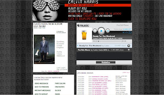
A clear artist image at the top with his name and the genre of his music – ‘Electro/Indie/Punk.’ Underneath this is links to his photos and videos. His photos contain lots of pictures of him at specific events that can be recognisable to the audience, and his videos contain videos such as the making of his latest music video and his actual music videos themselves. There is also a playlist that plays his two most recent and well-known tracks. Right at the top, there is a striking web banner that is advertising his new album through the bold album cover image. It tells us what hit singles the album contains, as well as informing us of when his new single will be out and a link to where we can download it now. There is also a list of his upcoming shows and links to his blog entries – the most recent one informs us of his album release. There is also other information such as a link to his main website, a list of his main musical influences, the name of his record label and its type. There are also links to his merchandise store as well as a chance for fans to sign up for his mailing list. There is also an email link where fans can email for his management, production and remix requests. There are also links to other sites that fans can find him on such as Twitter, Facebook and YouTube. There is then links to his friends and his chosen ‘Top 12.’ There is then a chance for his friends to leave comments. Very interactive as the fans can really get involved.
Design/Layout:
Image of him right at the top so it’s the first thing you see and is instantly recognisable. His music playlist is then directly beside this so it’s all about selling his music and getting the fans to listen to his songs and then buy them. Underneath all this is the list of his upcoming shows, blogs and general information about him as an artist. The prominent colour used for this site is grey and this is consistent throughout. It all ties in with his key images such as his album cover which is shot in black and white. The background used is a compilation of the same image of Calvin Harris using the same colours of black, grey and different shades. The key iconography is the glasses that we see Calvin Harris wear. These are instantly recognisable to his fans and feature on his album cover, MySpace background and he is wearing them in the main artist image. It also ties in a lot with one of his most successful singles, ‘I’m Not Alone’ where he also wears them. There is also a phrase where it says ‘Protected by forensic science’ and this all ties in with the overall image and reflects what he was going for in his ‘I’m Not Alone’ music video. The font stays the same but bold font is used to highlight key areas.
Audience & Institution:
Primary target audience seems to be older teenagers and young adults – males and females. The design of the website is stylised but not over the top. Its clean cut and its simplicity will appeal to this audience. The website also mentions Calvin's Record Label (Fly Eye/Columbia) and describes it as major.
Main Features:

Clear band image with their name above it and the genre of their music, ‘Indie / Hip Hop.’ Underneath is links to their photos which contains an album of the band themselves (featuring press shots, live performance shots on stage, and general photos of the band for fans to enjoy), as well as an album for performance photos of them in London and also an album for Gym Class Heroes fan tattoos where fans send in photos of tattoos they have dedicated to the band. The link to their videos contains their music videos and live performances. There is also a playlist of some of their songs and a list of upcoming shows. At the top is a large web banner advertising their new album ‘The Quilt,’ which can be downloaded and is available for $9.99. There is also links to their blogs and links to their official website, as well as a list of the band members and the role they play such as Travis on vocals. There is also a link where fans can join their street team where they play a role in helping promote the band and their music such as putting posters up, handing out fliers etc. Other links include those to band member’s twitter pages and other bands/artists that are their labelmates (a way for their label to market other bands). There is also a link to their UK webstore where fans can buy band merchandise. There are also slide shows of photos from their recent music videos, with links underneath for fans to watch the video, buy the album and download the video. There is also a chance for fans order albums or download them, as well as a link to join their official fan club where they can receive access to exclusive news, videos, contests etc. you can also sign up for alerts by entering your email address, mobile number, postcode etc. There is also the name of their record label ‘Decaydance / Fueled By Ramen’ which is said to be ‘Indie’ by ‘Type of Label.’ There is then links to their friends, a box for their ‘Top 24’ and a chance for users to leave comments.
Design/Layout:
The most striking feature for the design of the website is the background which is in the style of a quilt in order to fit in with the album name and image. There is then ‘stitching’ around the edges which fits in with the band logo seen on the album cover. This same font/logo is used above the main band image of their MySpace. They use a simple white font, however, important information is highlighted in red. The overall image all ties in together and is consistent regarding the bands image and their album cover.
Audience & Institution:
I think their band appeals to teenagers and this is shown a lot through their MySpace, regarding the range of colours they use, the font etc. There are lots of chances for fans to really get involved with the band and their seems to be a large fanbase with a lot of dedication, shown through the fan tattoos, the official fanclub, and the street team.
 Main Features:
Immediately see a photo of him at the top which is also the gallery. When you click on the photo it changes, like a slide show, and you can see all his photos.
One the right is a video which you can change to four different songs that features Plan B playing acoustic versions of his songs.
On this poster, you can click on links to lyrics of about 15 of his songs – a chance for the fans to sing along. There is also a link to his blog (http://www.bendrew.blogspot.com/) which tells the fans various information on himself, performance dates, interview etc. There is also links on his blog to a page for official Plan B ringtones, as well as his official YouTube page.
On his main website, there is a link to where you can shop for Plan B music and buy downloads for his albums, music videos, singles etc.
There is also the Plan B street team where fans can post up photos of themselves on the Plan B forum, in order to have their photos on his main websites and be part of his unofficial street team.
There is then links to news (his blog), the forum, dates and locations where he’s performing live, links to downloads, a poster for his friends missing dog – Mushky and a links list to sites that relate to Plan B and that he likes.
You can also sign up where you put in your name, email, country, and mobile.
Design/Layout:
Set up like posters on a wall. It all navigates from the central yellow poster where he’s performing. From there, you can click on links and the posters will move around to bring what you want to the front/middle.
Overall, the websites reflects the artist’s down-to-earth image and urban lifestyle.
All very interactive for the audience.
Audience & Institution:
Appeals to young males.
Main Features:

Enter the website and her songs automatically start playing. You can then go through and pick which ones you want to listen to. Next to that is a phone number and a chance to ‘Call Katy Perry’ and keep updated with the latest. Underneath that is links to the home page, news, shows, her ‘dear diary,’ lyrics, pictures, telly (videos that feature Katy Perry), her biography, extras (eg. downloadable wallpapers, banners, widgets, buddy icons etc.), as well as a link to her store where you can buy official Katy Perry merchandise. There is also links to where you can order her debut album ‘One of the Boys,’ as well as watching her music videos. There is also a chance to download remixes of her songs from iTunes, a link to her street team, MySpace, Message board, ringtones (where you can also make your own Katy Perry ringtone) and her mailing list.
Design/Layout:
It is very simple to navigate and this therefore appeals to its young target audience of girls. The layout is simple with all the links down the right hand side and a large image of Katy Perry on the left. The colours of blue and pink dominate the website and this is all coordinated as a theme throughout the whole site. These colours would stereotypically appeal to the girls (her main target audience) but the use of blue can also be seen as appealing to boys, as well as the title of her album, ‘One of the Boys.’ However the fonts and the graphics which include stars, hearts and birds are all very girly. Also the spelling of things such as pictures which is spelt ‘Pix’ and television which is spelt ‘telly’ will appeal to young girls as it makes it less formal, as well as her blog which is called ‘Dear Diary.’
Audience & Institution:
Her website seems to appeal predominantly to young girls, and we can see this through the use of pink as the dominant colour, as well as the graphics which include birds, stars and hearts. The fonts used are also very girly. The main image of Katy Perry on the website (see picture above) also ties in with the themes and appeals to the girls through her pose and costume. The website also has international appeal and allows audience abroad to really get involved with her music. There is a news section which gives news on Katy Perry in 13 different countries. This widens the appeal of the website.
Album Cover Deconstruction

 Main image is of the main artist, merged into a moon. It’s a striking image that really captures the audience’s attention – this is the function of the front cover, to get people to notice it and entice them into buying it. It's also used to be familiar to the audience and therefore instantly recognisable to the fans.
The image also relates to and anchors the title of the album – ‘Man on the Moon.’
It’s a close-up, profile of the main artist, and this dominates most of the album cover, along with the moon which covers the other half.
Key colours range from the orangey effect on the moon to the reds/purples/blues on Kid Cudi’s face.
Sense of dreaming, being somewhere beyond earth. Kid Cudi comments that “I’m always dreaming away, I’m always just in my own little realm and in my own little space, and that goes back to the man on the moon thing.”
Futuristic style font placed in the centre to stand out, along with the use of white to make it clear against the darker background. There is also a small space-like logo to fit in with the whole theme.
Has more of an arty feel compared to most albums that belong to the hip-hop genre. He’s been trying to create something new and that is reflected in the album cover. The genre of his music is described as Alternative Hip Hop, Trip-Hop (downtempo electronic music), with some alternative rock.
Concept album (unified by a theme) – space, sci-fi, movies
The album seems to appeal to a fairly mainstream audience; however the unique design of the cover which reflects his music in this album, may not appeal to all mainstream hip hop fans.
Parental Advisory - explicit content

The summary at the top is like a synopsis of a movie – features film language such as ‘all star cast,’ ‘from the guys who brought…’ ‘the long awaited tale,’ etc.
Fonts – futuristic style which fits with the image on the back which is like an x-ray effect.
Colours of the font also stand out with the white font against the dark background and the colour orange to distinguish each ‘Act.’
First studio album
Universal Motown Records – his record label
Dream On/G.O.O.D Music production
Barcode
Website details - Kid Cudi’s official website, as well as his record labels.
Institutional information (pug) such as record label, producers etc. is small compared to the rest – doesn’t detract from the main focus.

Poster, book of lyrics etc.


Album Cover Conventions
1. What are the typical features that an album cover has? Make a list of all the elements they have in common.
• Album title
• Artist name
• Cover art/clear striking image – distinct imagery (generally relates to artist iconography)
• Running colour scheme
• Track list on the back
• Pug – legal/institutional information
• Barcode
• Web address – for the Record Label, the Artist etc.
• Booklet with extras – song lyrics, photos, poster etc.
2. How would you categorise the covers in front of you? Are there any other ways of distinguishing between them other than generically?
• Genre
• Gender – male/female
• Group or solo artist
• Use of artwork?/artist image?/photography? Or a combination
• Target audience
• Different Record Labels
• Era
3. Album covers serve many different functions. What do you think these are (ie. what is their purpose?)
• Attract and catch the attention of the buyer and the target audience – stands out
• Creates a band image/identity that they are trying to sell - promotes them – it’s a marketing tool
• The style reflects the artist – recognisable to audience
• Displays the genre of music visually
• Gives a track listing with the track names, lengths etc.
• Informative eg. Legal stuff, institutional information - Record label etc.
