

Calvin Harris:
http://www.myspace.com/calvinharristv
Main Features:
Clear band image with their name above it and the genre of their music, ‘Indie / Hip Hop.’ Underneath is links to their photos which contains an album of the band themselves (featuring press shots, live performance shots on stage, and general photos of the band for fans to enjoy), as well as an album for performance photos of them in London and also an album for Gym Class Heroes fan tattoos where fans send in photos of tattoos they have dedicated to the band. The link to their videos contains their music videos and live performances. There is also a playlist of some of their songs and a list of upcoming shows. At the top is a large web banner advertising their new album ‘The Quilt,’ which can be downloaded and is available for $9.99. There is also links to their blogs and links to their official website, as well as a list of the band members and the role they play such as Travis on vocals. There is also a link where fans can join their street team where they play a role in helping promote the band and their music such as putting posters up, handing out fliers etc. Other links include those to band member’s twitter pages and other bands/artists that are their labelmates (a way for their label to market other bands). There is also a link to their UK webstore where fans can buy band merchandise. There are also slide shows of photos from their recent music videos, with links underneath for fans to watch the video, buy the album and download the video. There is also a chance for fans order albums or download them, as well as a link to join their official fan club where they can receive access to exclusive news, videos, contests etc. you can also sign up for alerts by entering your email address, mobile number, postcode etc. There is also the name of their record label ‘Decaydance / Fueled By Ramen’ which is said to be ‘Indie’ by ‘Type of Label.’ There is then links to their friends, a box for their ‘Top 24’ and a chance for users to leave comments.
Design/Layout:
The most striking feature for the design of the website is the background which is in the style of a quilt in order to fit in with the album name and image. There is then ‘stitching’ around the edges which fits in with the band logo seen on the album cover. This same font/logo is used above the main band image of their MySpace. They use a simple white font, however, important information is highlighted in red. The overall image all ties in together and is consistent regarding the bands image and their album cover.
Audience & Institution:
I think their band appeals to teenagers and this is shown a lot through their MySpace, regarding the range of colours they use, the font etc. There are lots of chances for fans to really get involved with the band and their seems to be a large fanbase with a lot of dedication, shown through the fan tattoos, the official fanclub, and the street team.
 Main Features:
Immediately see a photo of him at the top which is also the gallery. When you click on the photo it changes, like a slide show, and you can see all his photos.
One the right is a video which you can change to four different songs that features Plan B playing acoustic versions of his songs.
On this poster, you can click on links to lyrics of about 15 of his songs – a chance for the fans to sing along. There is also a link to his blog (http://www.bendrew.blogspot.com/) which tells the fans various information on himself, performance dates, interview etc. There is also links on his blog to a page for official Plan B ringtones, as well as his official YouTube page.
On his main website, there is a link to where you can shop for Plan B music and buy downloads for his albums, music videos, singles etc.
There is also the Plan B street team where fans can post up photos of themselves on the Plan B forum, in order to have their photos on his main websites and be part of his unofficial street team.
There is then links to news (his blog), the forum, dates and locations where he’s performing live, links to downloads, a poster for his friends missing dog – Mushky and a links list to sites that relate to Plan B and that he likes.
You can also sign up where you put in your name, email, country, and mobile.
Design/Layout:
Set up like posters on a wall. It all navigates from the central yellow poster where he’s performing. From there, you can click on links and the posters will move around to bring what you want to the front/middle.
Overall, the websites reflects the artist’s down-to-earth image and urban lifestyle.
All very interactive for the audience.
Audience & Institution:
Appeals to young males.
Main Features:
Enter the website and her songs automatically start playing. You can then go through and pick which ones you want to listen to. Next to that is a phone number and a chance to ‘Call Katy Perry’ and keep updated with the latest. Underneath that is links to the home page, news, shows, her ‘dear diary,’ lyrics, pictures, telly (videos that feature Katy Perry), her biography, extras (eg. downloadable wallpapers, banners, widgets, buddy icons etc.), as well as a link to her store where you can buy official Katy Perry merchandise. There is also links to where you can order her debut album ‘One of the Boys,’ as well as watching her music videos. There is also a chance to download remixes of her songs from iTunes, a link to her street team, MySpace, Message board, ringtones (where you can also make your own Katy Perry ringtone) and her mailing list.
Design/Layout:
It is very simple to navigate and this therefore appeals to its young target audience of girls. The layout is simple with all the links down the right hand side and a large image of Katy Perry on the left. The colours of blue and pink dominate the website and this is all coordinated as a theme throughout the whole site. These colours would stereotypically appeal to the girls (her main target audience) but the use of blue can also be seen as appealing to boys, as well as the title of her album, ‘One of the Boys.’ However the fonts and the graphics which include stars, hearts and birds are all very girly. Also the spelling of things such as pictures which is spelt ‘Pix’ and television which is spelt ‘telly’ will appeal to young girls as it makes it less formal, as well as her blog which is called ‘Dear Diary.’
Audience & Institution:
Her website seems to appeal predominantly to young girls, and we can see this through the use of pink as the dominant colour, as well as the graphics which include birds, stars and hearts. The fonts used are also very girly. The main image of Katy Perry on the website (see picture above) also ties in with the themes and appeals to the girls through her pose and costume. The website also has international appeal and allows audience abroad to really get involved with her music. There is a news section which gives news on Katy Perry in 13 different countries. This widens the appeal of the website.
http://www.myspace.com/calvinharristv
Main Features:
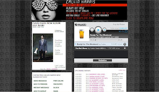
A clear artist image at the top with his name and the genre of his music – ‘Electro/Indie/Punk.’ Underneath this is links to his photos and videos. His photos contain lots of pictures of him at specific events that can be recognisable to the audience, and his videos contain videos such as the making of his latest music video and his actual music videos themselves. There is also a playlist that plays his two most recent and well-known tracks. Right at the top, there is a striking web banner that is advertising his new album through the bold album cover image. It tells us what hit singles the album contains, as well as informing us of when his new single will be out and a link to where we can download it now. There is also a list of his upcoming shows and links to his blog entries – the most recent one informs us of his album release. There is also other information such as a link to his main website, a list of his main musical influences, the name of his record label and its type. There are also links to his merchandise store as well as a chance for fans to sign up for his mailing list. There is also an email link where fans can email for his management, production and remix requests. There are also links to other sites that fans can find him on such as Twitter, Facebook and YouTube. There is then links to his friends and his chosen ‘Top 12.’ There is then a chance for his friends to leave comments. Very interactive as the fans can really get involved.
Design/Layout:
Image of him right at the top so it’s the first thing you see and is instantly recognisable. His music playlist is then directly beside this so it’s all about selling his music and getting the fans to listen to his songs and then buy them. Underneath all this is the list of his upcoming shows, blogs and general information about him as an artist. The prominent colour used for this site is grey and this is consistent throughout. It all ties in with his key images such as his album cover which is shot in black and white. The background used is a compilation of the same image of Calvin Harris using the same colours of black, grey and different shades. The key iconography is the glasses that we see Calvin Harris wear. These are instantly recognisable to his fans and feature on his album cover, MySpace background and he is wearing them in the main artist image. It also ties in a lot with one of his most successful singles, ‘I’m Not Alone’ where he also wears them. There is also a phrase where it says ‘Protected by forensic science’ and this all ties in with the overall image and reflects what he was going for in his ‘I’m Not Alone’ music video. The font stays the same but bold font is used to highlight key areas.
Audience & Institution:
Primary target audience seems to be older teenagers and young adults – males and females. The design of the website is stylised but not over the top. Its clean cut and its simplicity will appeal to this audience. The website also mentions Calvin's Record Label (Fly Eye/Columbia) and describes it as major.
Main Features:

Clear band image with their name above it and the genre of their music, ‘Indie / Hip Hop.’ Underneath is links to their photos which contains an album of the band themselves (featuring press shots, live performance shots on stage, and general photos of the band for fans to enjoy), as well as an album for performance photos of them in London and also an album for Gym Class Heroes fan tattoos where fans send in photos of tattoos they have dedicated to the band. The link to their videos contains their music videos and live performances. There is also a playlist of some of their songs and a list of upcoming shows. At the top is a large web banner advertising their new album ‘The Quilt,’ which can be downloaded and is available for $9.99. There is also links to their blogs and links to their official website, as well as a list of the band members and the role they play such as Travis on vocals. There is also a link where fans can join their street team where they play a role in helping promote the band and their music such as putting posters up, handing out fliers etc. Other links include those to band member’s twitter pages and other bands/artists that are their labelmates (a way for their label to market other bands). There is also a link to their UK webstore where fans can buy band merchandise. There are also slide shows of photos from their recent music videos, with links underneath for fans to watch the video, buy the album and download the video. There is also a chance for fans order albums or download them, as well as a link to join their official fan club where they can receive access to exclusive news, videos, contests etc. you can also sign up for alerts by entering your email address, mobile number, postcode etc. There is also the name of their record label ‘Decaydance / Fueled By Ramen’ which is said to be ‘Indie’ by ‘Type of Label.’ There is then links to their friends, a box for their ‘Top 24’ and a chance for users to leave comments.
Design/Layout:
The most striking feature for the design of the website is the background which is in the style of a quilt in order to fit in with the album name and image. There is then ‘stitching’ around the edges which fits in with the band logo seen on the album cover. This same font/logo is used above the main band image of their MySpace. They use a simple white font, however, important information is highlighted in red. The overall image all ties in together and is consistent regarding the bands image and their album cover.
Audience & Institution:
I think their band appeals to teenagers and this is shown a lot through their MySpace, regarding the range of colours they use, the font etc. There are lots of chances for fans to really get involved with the band and their seems to be a large fanbase with a lot of dedication, shown through the fan tattoos, the official fanclub, and the street team.
Main Features:Immediately see a photo of him at the top which is also the gallery. When you click on the photo it changes, like a slide show, and you can see all his photos.
One the right is a video which you can change to four different songs that features Plan B playing acoustic versions of his songs.
On this poster, you can click on links to lyrics of about 15 of his songs – a chance for the fans to sing along. There is also a link to his blog (http://www.bendrew.blogspot.com/) which tells the fans various information on himself, performance dates, interview etc. There is also links on his blog to a page for official Plan B ringtones, as well as his official YouTube page.
On his main website, there is a link to where you can shop for Plan B music and buy downloads for his albums, music videos, singles etc.
There is also the Plan B street team where fans can post up photos of themselves on the Plan B forum, in order to have their photos on his main websites and be part of his unofficial street team.
There is then links to news (his blog), the forum, dates and locations where he’s performing live, links to downloads, a poster for his friends missing dog – Mushky and a links list to sites that relate to Plan B and that he likes.
You can also sign up where you put in your name, email, country, and mobile.
Design/Layout:
Set up like posters on a wall. It all navigates from the central yellow poster where he’s performing. From there, you can click on links and the posters will move around to bring what you want to the front/middle.
Overall, the websites reflects the artist’s down-to-earth image and urban lifestyle.
All very interactive for the audience.
Audience & Institution:
Appeals to young males.
Main Features:

Enter the website and her songs automatically start playing. You can then go through and pick which ones you want to listen to. Next to that is a phone number and a chance to ‘Call Katy Perry’ and keep updated with the latest. Underneath that is links to the home page, news, shows, her ‘dear diary,’ lyrics, pictures, telly (videos that feature Katy Perry), her biography, extras (eg. downloadable wallpapers, banners, widgets, buddy icons etc.), as well as a link to her store where you can buy official Katy Perry merchandise. There is also links to where you can order her debut album ‘One of the Boys,’ as well as watching her music videos. There is also a chance to download remixes of her songs from iTunes, a link to her street team, MySpace, Message board, ringtones (where you can also make your own Katy Perry ringtone) and her mailing list.
Design/Layout:
It is very simple to navigate and this therefore appeals to its young target audience of girls. The layout is simple with all the links down the right hand side and a large image of Katy Perry on the left. The colours of blue and pink dominate the website and this is all coordinated as a theme throughout the whole site. These colours would stereotypically appeal to the girls (her main target audience) but the use of blue can also be seen as appealing to boys, as well as the title of her album, ‘One of the Boys.’ However the fonts and the graphics which include stars, hearts and birds are all very girly. Also the spelling of things such as pictures which is spelt ‘Pix’ and television which is spelt ‘telly’ will appeal to young girls as it makes it less formal, as well as her blog which is called ‘Dear Diary.’
Audience & Institution:
Her website seems to appeal predominantly to young girls, and we can see this through the use of pink as the dominant colour, as well as the graphics which include birds, stars and hearts. The fonts used are also very girly. The main image of Katy Perry on the website (see picture above) also ties in with the themes and appeals to the girls through her pose and costume. The website also has international appeal and allows audience abroad to really get involved with her music. There is a news section which gives news on Katy Perry in 13 different countries. This widens the appeal of the website.

0 comments:
Post a Comment