The project is now finished!
I'm really happy with the end results soooo this blog is now closed
xxxx
Band Website
Thursday, December 17, 2009
Closing Post
Posted by LATYMERMEDIA at 7:39 AM 0 comments
Evaluation Question 1
Here's parts of Question 1 that we filmed. I think this part represents my contribution to this question well. The rest of the evaluation footage for Question 1 can be found on the group blog. Click Here for Question 1.
I think our answer to question 1 went well, although it was a little long. I think I made a good contribution to it and I think I answered the question, which is illustrated above. However, I think I could have got to the point a little quicker, as I did tend to ramble on a bit. Overall I think we covered everything that we had planned to say.
Posted by LATYMERMEDIA at 5:13 AM 0 comments
Labels: Evaluation, Evaluation: Question 1
Evaluation Question 2
Here's Question 2 of the evaluation:
I think this question went quite well. We spoke about everything that we wanted to say, however I was less comfortable with this question as Mel had worked on it more than me as we had split the planning of the questions between us. Therefore I don't think I spoke as much as Mel, but I think I did still manage to make a good contribution and I was able to bounce of Mel's comments.
Posted by LATYMERMEDIA at 5:13 AM 0 comments
Labels: Evaluation, Evaluation: Question 2
Evaluation Question 3
Here's one of the parts of Question 3. I think this part demonstrates my contribution to the question well. Click Here for the rest of Question 3.
For Question 3, I think we spoke about the audience well and who we were intending on targetting. We relfected and analysed the feedback that we had got and showed that we found it really useful. I think we answered this question well and spoke in depth about the comments that we had receieved about our three products. I think I definately contributed well to this question and I found it easier as it was the question that I had planned.
Posted by LATYMERMEDIA at 5:12 AM 0 comments
Labels: Evaluation, Evaluation: Question 3
Evulation Question 4
Here's the answer to Question 4:
I think we answered this question well, analysing all the technologies that we have used throughout this project. However one thing I think we could have improved on is that we could have mentioned technologies that we haven't used, such as a MAC, and explained why and gave our opinions on this.
Posted by LATYMERMEDIA at 5:12 AM 0 comments
Labels: Evaluation, Evaluation: Question 4
Wednesday, December 16, 2009
Planning for the Evaluation
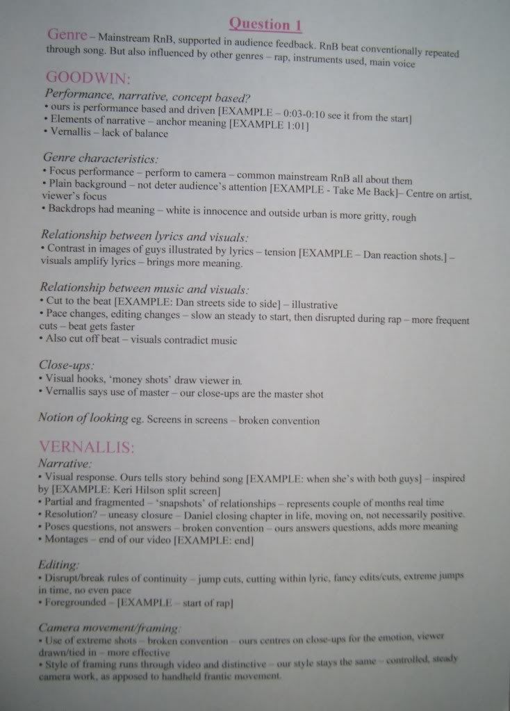
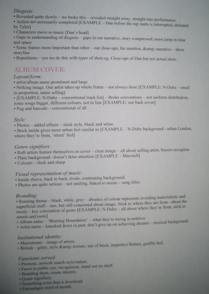
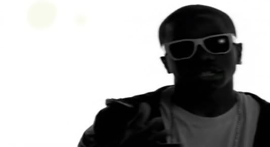
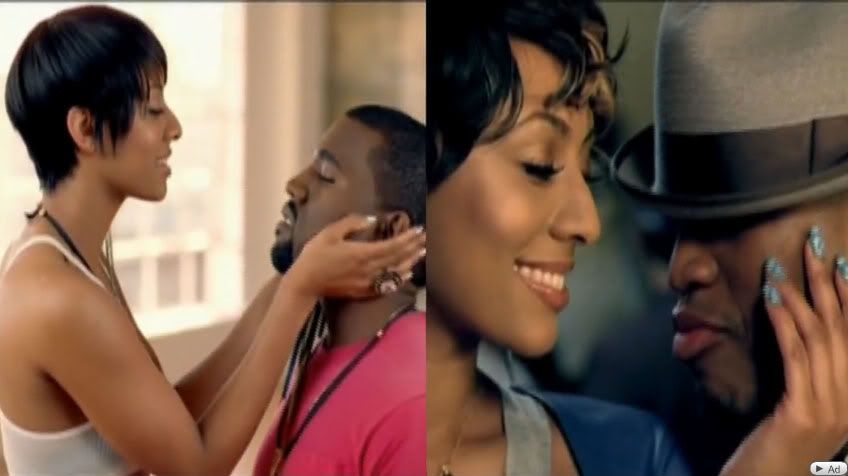
When planning for the evaluation, Mel and I did a rough plan for all four questions. However, to use our time more efficiently, we decided to split the questions between us where we would go into more detail. I did Question 1 and Question 3. Here are the notes that I made for both questions:
Question 1
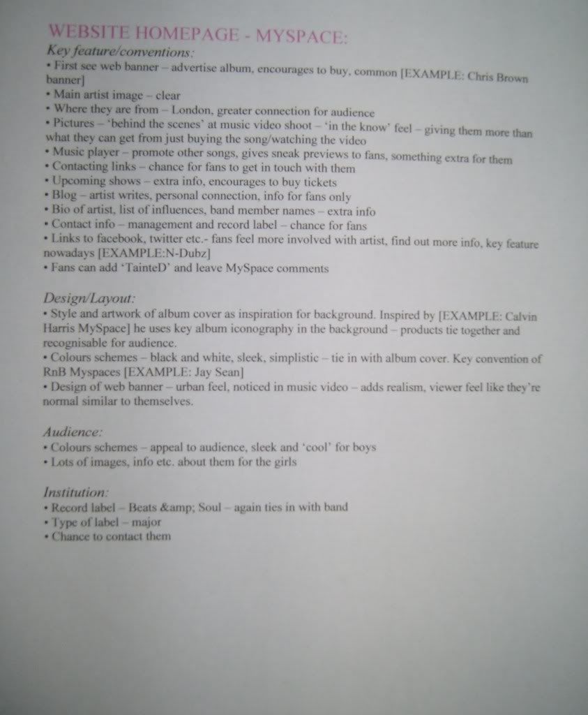
Question 3
Jason Derulo - Watcha Say
Tinchy Stryder Ft Taio Cruz 'Take Me Back':
Inspiration taken from Keri Hilson - Knock You Down:
Inspiration taken from James Morrison Ft Nelly Furtado - Broken strings:
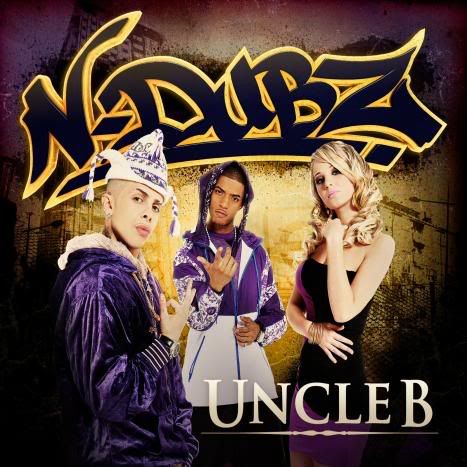
N-Dubz ‘Uncle B’ Album Cover:

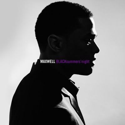
Maxwell ‘BLACK Summer’s Night’ Album cover:
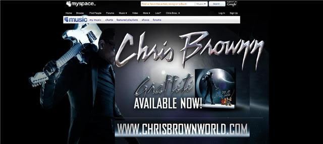
Chris Brown MySpace Banner:
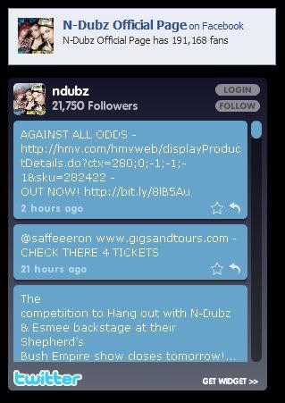
N-Dubz Twitter Widget as well as a link to their official Facebook page:
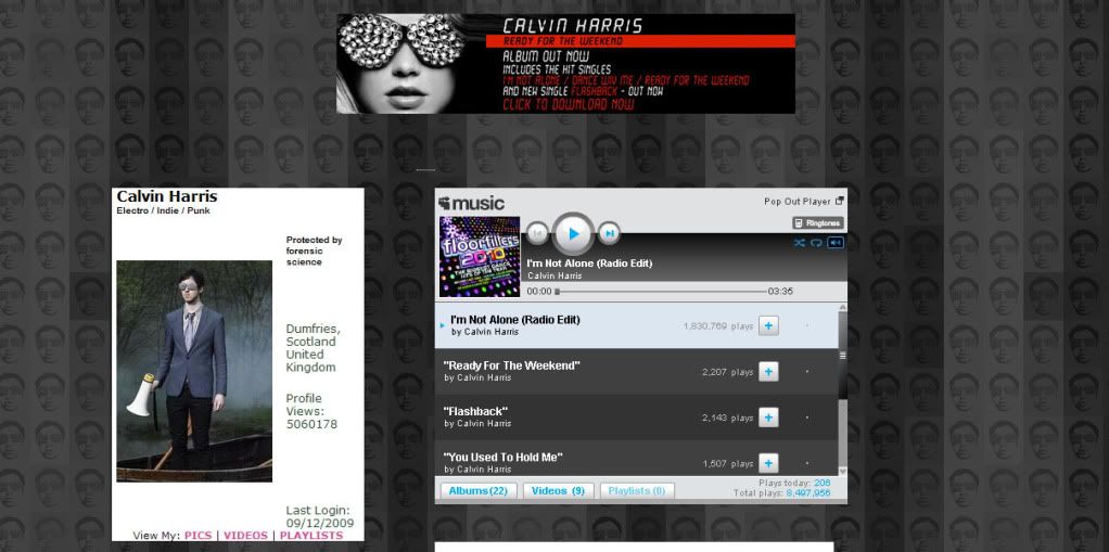
Calvin Harris MySpace – Background links to album artwork:
http://www.myspace.com/calvinharristv
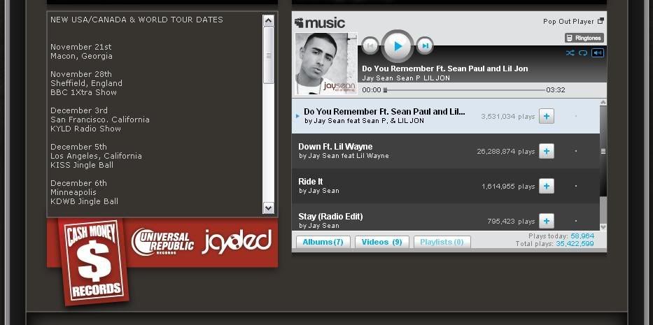
Jay Sean MySpace - Style/Colours are conventions:
http://www.myspace.com/jaysean
Posted by LATYMERMEDIA at 7:10 AM 0 comments
Labels: Evaluation, Planning
Monday, December 14, 2009
Music Video
Here's our final music video. I'm really happy with the results and I think we've achieved the effect that we wanted. Although in hindsight there are a couple of things I would change, such as more varied shots eg. some of the girl, more movement and choppy editing etc. I think it still works really well as it is. We've cleary shown the contrast and division in the two artists, as well as showing that these two genres of music work well together. We've also got accross the emotion in the song that we heard from the first time we listened to it. So overall, I'm really happy with it.
Posted by LATYMERMEDIA at 6:19 AM 0 comments
Labels: Final Video, Production, Reflections
MySpace
Here's our band website. We chose to do a MySpace page. I think its turned out well and the design ties in with our proucts well, meaning it all works together as a promotional package. I think we could have been a little more experimental with the design/layout, however I also think it's simplicity works well with our artists.
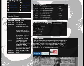
www.myspace.com/tainted09
Posted by LATYMERMEDIA at 5:21 AM 0 comments
Labels: MySpace, Production, Reflections
Album Cover
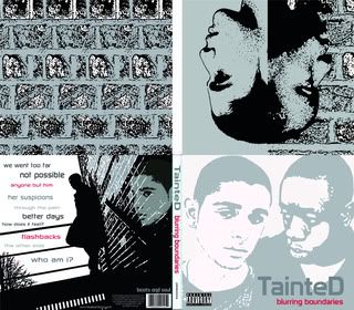
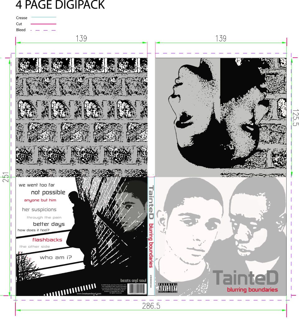
Here's our final digipack. I think the album cover, both the front and back, as well as the inside sleeve and CD back, all work well together. The design runs through the digipack and the style all relates well to the other proudcts we have made.
Posted by LATYMERMEDIA at 5:20 AM 0 comments
Labels: Album Covers, Production, Reflections
Thursday, December 10, 2009
Evaluation
We had our evaluation yesterday where we filmed our responses to the four questions. We prepared notes which are on the group blog. We split it so that we each did the notes for two questions and we then lead these questions when we actually filmed it. I did question 1 (conventions) and question 3 (audience).
During the filming of the evaluation, we were a little nervous because it was something really different, but overall I think it went well. From what I can remember, we covered everything that we wanted to and we didn't really have any problems with how much we each said. I think it was a roughly 50/50 split in the amount that we each spoke and it was easy to bounce off each other because there were only two of us. Soo hopefully it was ok.
Posted by LATYMERMEDIA at 2:47 AM 0 comments
Labels: Evaluation, Reflections
Tuesday, December 8, 2009
Audience Feedback
We had a screening today where we showed our target audience the three products that we have made. They gave us feedback that meant we could see if we were targeting the right audience, as well as finding out some improvements that could be made and seeing what effect or impact the three products had on the audience.
Click here for all the feedback

Everyone said it looked like a real music video and looked professional. Reasons for these were:
• Lipsynching
• The backgrounds – the studio and outside
• Close-ups
• Black and white
• Flashbacks
• The actors
• The camerawork
• Cuts to the music
• The performance
• Lighting
Overall, we got really positive feedback about whether it was believable as a real music video. This is really good as it shows that we have followed and used the conventions of real music videos. From this feedback, I think that the locations (white studio and outside), actors (performance, lip-synch, attitude etc.), lighting and the use of black and white were the strongest elements of our video. This is really good because these are the parts that our video centres around.
Music videos should be entertaining and this is so that people watch the video again and again - when we asked people if they'd watch it again, most said yes, and when asked if they'd download/buy the song, most said yes as it 'enjoyable' and 'catchy.' Entertainment is also important for word of mouth as it will encourage people to talk about it. This optimizes the amount that we are able to promote the song. When we asked people if they found it entertaining, most people said yes (18 out of 22). The reasons they gave were:
• Good actors/Good Performance
• Like the conflicting element between the two singers/two sides to the story
• Liked the black and white
• Liked the setting
However, four people did say no and the reasons they gave were that it was a bit repretitive and stays the same all the way through. I do agree that the start of the video can be abit repetitive, but we wanted this strong performance at the start, and then its disrupted by the rapper. So I don't agree that it stays the same all the way through. There is a point of change, and this interrupts Daniel's performance, representing the fact that Tyler, the rapper, interrupts and disrupts Daniel's life. We also have the narrative elements throughout the video.
Appeal is also important. We wanted to see if the music video appealed to our audience to ensure that we were targetting the right audience. I think this was fairly successful as we did appeal to most people. The parts that appealed to them were:
• The outside city shots
• The black and white
• The flashback and storyline – interesting narrative
• Performance – you feel for the main character
• The different characters and the way it switches between them
A couple were unsure and they said that they just didn’t like the shots of just the singer as they found it a bit boring. Someone also said that they found the first part of the video really interesting but then found that nothing really happens.
We also had a few people say no (4 people.) Their reasons were that they found it a little bland with not enough action and movement and therefore found it a bit boring.
I can see why they said this; however we were going for this effect at the start. We found that too much movement and choppy editing just didn’t fit with the song and we wanted to focus mainly on the character’s emotion, therefore we made it look very simple, just concentrating on the guys, how they are feeling and what they are saying.
Understanding of the video/song is also important, although a lack of understanding the first time you watch it can also have an enigmatic effect, making you want to watch it again. When we asked our audience if they understood the narrative behind our music video, everyone said yes. This was really good as we only had a couple of shots of narrative in our music video, but we managed to get accross the story in this short amount of time. Most people also understood that it was a band/duo, however some thought it was two artists collaborating on a track. This is probably due to the fact that it is a combination of such different genres of music, however we thought this is what would make our band different and can be their unique selling point.
The appeal of the artists is also important for fans. We had to consider this when we chose our actors and I think we made the right decisions because people said:
• Young and ‘cool.’ Appeal to teenage guys.
• Good emotion – very convincing
• The black guy is likeable – smug and cocky. The main guy is so cute, I feel sorry for him
• They are so different – both physically and their attitudes.
• They are emotional – it’s good - you feel sorry for the guy singing who’s lost his love.
• Good looking
We also asked people for their criticisms as this is important to find out what we can improve on and think about what we would change.
Some criticisms people made were:
• A little less black and white
• Shots up against the wall look a bit over the top/cheesey
• The white circle around the shots on the flashbacks did not look as professional as it could.
• Some parts where the singer gets repeated too many times - needs to be a bit more going on.
• Not enough shots of the girl
• Could be more choppy and more camera movement - could be a bit more varied and dramatic
I agree with most of these points. We did try to do some shots in colour, such as the narrative but we decided that this just didn’t work and didn’t look right so we decided to put it all in black and white. I also think the white circle on the flashbacks do not look as professional as they could – I don’t think they achieved that ‘dreamy’ affect that we wanted. I also think that it is a good idea to add more shots of the girl – this will also add variety. We did try to make it more choppy with editing but this was difficult with the song as its quite slow and we didn’t think that it would have as much emotional impact.
We also wanted some feedback on the other products that we made (the digipak and the MySpace). We asked people if they liked them and if they thought all 3 products tied together well.
They liked the:
• Running colour schemes - Black/White/Grey
• The opposites/contrast between the artists.
• “Cool effects and it looks stylish.”
• “Album looks good and MySpace has a nice layout”
• “They follow the same theme and capture the mood of the video”
Some improvements were:
• Could be a bit more colourful and exciting
• Think the back cover looks a bit empty, and the front cover as well. Perhaps more colour for contrast.
• MySpace could be a bit more interesting.
I can see why people may have wanted more colour used in the products; however we found that the absence of colour was a convention of the genre, particularly with male artists. We did try to add some colour that we thought would still tie in, such as the red used on the album cover however we didn’t want to use too much.
Overall, this feedback session was really helpful and we got some useful information about our audience and how they feel about the products that we have made.
Posted by LATYMERMEDIA at 1:21 AM 0 comments
Labels: Audience, Evaluation, Feedback, Reflections
Friday, November 27, 2009
Progress Update
Early this week we have spent our time finishing off the video, by adding in the narrative shots, filling in gaps, tweaking small bits, tightening cuts etc. I used a lot of my free time to edit and we have been focussing on that to get the video finished as quickly as possible before Friday’s deadline.
Last week we used some time to finish the inside sleeve for our album cover, as well as the track list for the back cover. However, we’ve decided that we’ll split the rest of the work between us so that we use our time more efficiently. Therefore we decided I would design the MySpace and Mel would design the rest of the album. As we had spoken about what we wanted from both the MySpace and the album cover, we both knew what to do. Therefore I spent the rest of this week completing the MySpace so that it was ready for today’s deadline. Mel also finished the album cover, so our digipak was complete. The music video was also finished from earlier this week. Therefore we completed all 3 products in time for the deadline today and so the production stage of this project is finished! I feel it’s gone really well and I’m happy with all three products and I think they all work well together.
Posted by LATYMERMEDIA at 5:00 AM 0 comments
Labels: Planning, Production, Reflections
Thursday, November 26, 2009
Test Screening
Today we decided that our music video was finally complete and ready to screen to other media students. This was so that we could get some final feedback and make any last minute changes. So we held a test screening which went really well. We could see it on a bigger screen, and this meant it was easier to spot any mistakes/problems.
One of the main problems was that the lipsynching was out. It was quite obvious, but we hadn’t noticed it on the edit suite. However this is easily changed if we move certain shots backwards or forwards by 1 or 2 frames. Some also said that the blur effect that we added onto the flashbacks was too much and they couldn’t see the shot properly so we just need to take that down a bit. They also thought that the white effect that we added around the edges of the shots was also too much and took up too much of the frame, therefore we also need to make this smaller, which I agreed with when I watched it on the big screen. Someone also didn’t see the relevance of the last shot (the one that’s out of focus) but our reason for this is that the last shot is summing it all up as it represents how he’s feeling which is lost and confused so we saw that as a good way to end the video.
Other feedback that we got was that everyone agreed that the performance that we got out of our actors was really good and believable as they felt sorry for Daniel’s character and saw Bernard’s as cocky and not really showing much emotion. They also liked the editing, particularly where we cut quickly and when we cut on beat. Soo overall it was really good and we only have small changes to make which shouldn't take long and then we are complete!
Posted by LATYMERMEDIA at 4:37 AM 0 comments
Labels: Audience, Production, Reflections
Wednesday, November 25, 2009
Shoot (Narrative)
We had a shoot yesterday where we filmed the narrative shots that are going to be in our video. We had planned to do quite a few shots, but a lot of these didn't work out on the day. This is because the actors found it quite difficult to do and we had to film when it was dark so we had some lighting issues even though we were inside. However after capturing the footage, I think we still have enough footage that we can use in the video.
We also made a decision to put the narrative shots in black and whites too (these were going to be in colour but it didnt look right), as well as adding the effect of a slight camera blurr and slow motion to distinguish it from the rest of the video. Another idea suggested was to put a white circle around the edges of the shots to achieve that dreamlike effect. We thought this was a good idea and represents the fact that it is Daniel who is thinking back to these moments.
Today we have also managed to come up with an artist name which we were really struggling with. But after playing around with the idea 'Tainted Dream's', we have come up with 'TainteD' where the 'T' and 'D' represent the artist names, which are 'Tyler' an 'Daniel.'
Posted by LATYMERMEDIA at 1:20 AM 0 comments
Labels: Production, Reflections, Shoot
Wednesday, November 18, 2009
Update
Since our last shoot, we have been concentrating on editing the video. We have made some changes such as deciding to do the performance part of the video in black and white, with the narrative in faded colour. The relevance of the black and white is to show that we are documenting the relationship of them now, and this will be distinguished from the narrative which tells the background story and will be shown in colour, but faded to show that it is a memory. We are also going to experiment with split screen to make the narrative more interesting and we can show two perspectives through this.
We have also made a decision about the artists themselves, and after much discussion, we have decided to make them a duo rather than two seperate artists with one featuring on the track, which we had planned before. However, as the two artists are so different, we thought we could play on this, with regards to the album cover and their name. An idea for an album cover name is ‘Blurring Boundaries.’ The idea behind this is that these two guys are coming together through music, and breaking new ground, as they are so different. We have also tested images for the album cover and have come up with an idea that reflects the album name and is a close-up image of the two guys with their heads joined and blurred together.
Our plan now is to finalise a band name for them, and then start working on the MySpace. We must also plan the other images that we want for the album, as well as plan the shoot that we are doing on Tuesday for the narrative part. We are going to create a schedule for the next week so that we know exactly what we are doing and can therefore work more efficiently to get everything completed in time.
Posted by LATYMERMEDIA at 1:29 PM 0 comments
Labels: Planning, Production, Reflections
Monday, November 16, 2009
Shoot
We had our final performance shoot/re-shoot this weekend, where we filmed Daniel on Saturday and Bernard on Sunday. The shoots went well and we had both actors moving a lot more in order for them to look more enthusiastic and this came across really well on camera. We also experimented more with the camera by doing more handheld shots and taking the camera into our hands to add more movement, as we noticed that the shots on our last shoot were slightly too static. This all meant that we had an overall more interesting set of shots to use.
Now we plan to edit all of our performance shots and put them into the video, as well as plan for the narrative shoot which will be next week, and try and finalise our album cover and MySpace at the same time.
Posted by LATYMERMEDIA at 1:28 PM 0 comments
Labels: Planning, Production, Reflections, Shoot
Monday, October 19, 2009
The Shoot
We had our main shoot yesterday which went pretty well, but after capturing the footage today, we have noticed that we may need to re-shoot quite a bit due to problems such as bad framing, things in shot that we don’t want to be there, not much movement etc. We also need more close-ups of both guys.
Our shoot however did go very smoothly. Both actors turned up on time and were well prepared with their lip synching. We had planned the day focussing mainly on the main artist who was with us for 10 hours (8am-6pm) which was pretty tiring for him. Our next actor arrived at 4 and was with us for two hours. We had only planned to do the shots of the two of them together in this time, however when we were left with spare time at the end, we decided to do some unplanned shots of our second artist in an outside location. Therefore the shoot was successful; however we need to look back over the footage in detail to decide what shots we need to shoot again and what extra shots we can get.
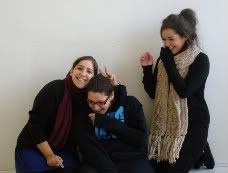
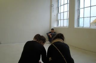
Here are some photos from the shoot:
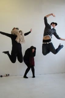
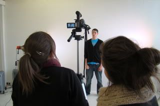
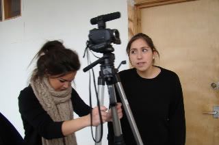
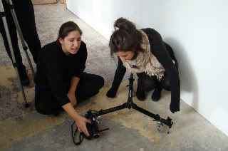

Posted by LATYMERMEDIA at 1:25 PM 0 comments
Labels: Production, Reflections, Shoot
Thursday, October 15, 2009
Planning…
This week we have been planning our shoot that is going to take place this Sunday. We visited the location that we want to use on Monday and did a location reccy to check its suitability. We liked the way that we could film in two different locations (outside and inside) and we have therefore developed this further and are going to make this contrast a main part of our video. We will place one artist in the outside, urban area and the other will be contrasted in the stark white room inside. This will distinguish them as different artists and will emphasise the conflict between them that we hear in this song.
As planning for the shoot, we gave been working on producing storyboards for tricky sequences in the video to ensure the shots work together, as well as a shooting schedule for the day and a call sheet for our actors.
As well as this planning, we have been developing our ideas for the video. We have decided that we want the conflict to be a main theme in the video and this could be shown through a build up to a confrontation between the two artists at the end of the video. We have also been trying to decide if we want to base our video on performance with narrative or with concept. Our concept ideas are the fact that we are demonstrating a realistic view on human relationships and society which can be shown through the contrasts in location and costume to demonstrate something like rich vs. poor. Or we thought about giving the song more of a storyline and portraying this vividly in the video. Our narrative ideas include things like the two guys as young boys, showing they have been best friends for a long time. As well as including a female actress and showing her with both guys to show that they have both dated her. Then we would show reaction shots of the main guy with things like him looking at old photos of them together etc. we have also discussed other ideas about the technical side to the video. We want to have structured, controlled camera work throughout the video (maybe until the end when it can become more handheld) in order to achieve that high gloss feel. We would contrast this would more handheld camera work at certain points in the video where we need to emphasise emotion. We have also thought about playing around with the focus settings in order to achieve some interesting shots. We have also said we want to include lots of jump cuts in the performance, for example we can have wide high angle shots of the main guy appearing all alone and deserted, and then cutting to a close-up to show his emotion.
So far I think we are on track and well prepared for our shoot later this week.
Posted by LATYMERMEDIA at 1:24 PM 0 comments
Labels: Planning, Reflections
Wednesday, October 14, 2009
Music Video Textual Analysis
Posted by LATYMERMEDIA at 4:06 PM 0 comments
Tuesday, October 13, 2009
DYM MYSPACE FEEDBACK
Your work appeared a little after the deadline, but the end result was worth the delay. Excellent presentation of research findings. Your Asher Roth, Katy Perry and Plan B examples have not been fully analysed though?
Posted by LATYMERMEDIA at 1:06 AM 0 comments
Labels: DYM, Teacher Feedback
Friday, October 9, 2009
Official Artist Websites/Myspace Analysis
http://www.myspace.com/calvinharristv
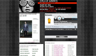
A clear artist image at the top with his name and the genre of his music – ‘Electro/Indie/Punk.’ Underneath this is links to his photos and videos. His photos contain lots of pictures of him at specific events that can be recognisable to the audience, and his videos contain videos such as the making of his latest music video and his actual music videos themselves. There is also a playlist that plays his two most recent and well-known tracks. Right at the top, there is a striking web banner that is advertising his new album through the bold album cover image. It tells us what hit singles the album contains, as well as informing us of when his new single will be out and a link to where we can download it now. There is also a list of his upcoming shows and links to his blog entries – the most recent one informs us of his album release. There is also other information such as a link to his main website, a list of his main musical influences, the name of his record label and its type. There are also links to his merchandise store as well as a chance for fans to sign up for his mailing list. There is also an email link where fans can email for his management, production and remix requests. There are also links to other sites that fans can find him on such as Twitter, Facebook and YouTube. There is then links to his friends and his chosen ‘Top 12.’ There is then a chance for his friends to leave comments. Very interactive as the fans can really get involved.
Design/Layout:
Image of him right at the top so it’s the first thing you see and is instantly recognisable. His music playlist is then directly beside this so it’s all about selling his music and getting the fans to listen to his songs and then buy them. Underneath all this is the list of his upcoming shows, blogs and general information about him as an artist. The prominent colour used for this site is grey and this is consistent throughout. It all ties in with his key images such as his album cover which is shot in black and white. The background used is a compilation of the same image of Calvin Harris using the same colours of black, grey and different shades. The key iconography is the glasses that we see Calvin Harris wear. These are instantly recognisable to his fans and feature on his album cover, MySpace background and he is wearing them in the main artist image. It also ties in a lot with one of his most successful singles, ‘I’m Not Alone’ where he also wears them. There is also a phrase where it says ‘Protected by forensic science’ and this all ties in with the overall image and reflects what he was going for in his ‘I’m Not Alone’ music video. The font stays the same but bold font is used to highlight key areas.
Audience & Institution:
Primary target audience seems to be older teenagers and young adults – males and females. The design of the website is stylised but not over the top. Its clean cut and its simplicity will appeal to this audience. The website also mentions Calvin's Record Label (Fly Eye/Columbia) and describes it as major.
Main Features:
Clear band image with their name above it and the genre of their music, ‘Indie / Hip Hop.’ Underneath is links to their photos which contains an album of the band themselves (featuring press shots, live performance shots on stage, and general photos of the band for fans to enjoy), as well as an album for performance photos of them in London and also an album for Gym Class Heroes fan tattoos where fans send in photos of tattoos they have dedicated to the band. The link to their videos contains their music videos and live performances. There is also a playlist of some of their songs and a list of upcoming shows. At the top is a large web banner advertising their new album ‘The Quilt,’ which can be downloaded and is available for $9.99. There is also links to their blogs and links to their official website, as well as a list of the band members and the role they play such as Travis on vocals. There is also a link where fans can join their street team where they play a role in helping promote the band and their music such as putting posters up, handing out fliers etc. Other links include those to band member’s twitter pages and other bands/artists that are their labelmates (a way for their label to market other bands). There is also a link to their UK webstore where fans can buy band merchandise. There are also slide shows of photos from their recent music videos, with links underneath for fans to watch the video, buy the album and download the video. There is also a chance for fans order albums or download them, as well as a link to join their official fan club where they can receive access to exclusive news, videos, contests etc. you can also sign up for alerts by entering your email address, mobile number, postcode etc. There is also the name of their record label ‘Decaydance / Fueled By Ramen’ which is said to be ‘Indie’ by ‘Type of Label.’ There is then links to their friends, a box for their ‘Top 24’ and a chance for users to leave comments.
Design/Layout:
The most striking feature for the design of the website is the background which is in the style of a quilt in order to fit in with the album name and image. There is then ‘stitching’ around the edges which fits in with the band logo seen on the album cover. This same font/logo is used above the main band image of their MySpace. They use a simple white font, however, important information is highlighted in red. The overall image all ties in together and is consistent regarding the bands image and their album cover.
Audience & Institution:
I think their band appeals to teenagers and this is shown a lot through their MySpace, regarding the range of colours they use, the font etc. There are lots of chances for fans to really get involved with the band and their seems to be a large fanbase with a lot of dedication, shown through the fan tattoos, the official fanclub, and the street team.
 Main Features:
Immediately see a photo of him at the top which is also the gallery. When you click on the photo it changes, like a slide show, and you can see all his photos.
One the right is a video which you can change to four different songs that features Plan B playing acoustic versions of his songs.
On this poster, you can click on links to lyrics of about 15 of his songs – a chance for the fans to sing along. There is also a link to his blog (http://www.bendrew.blogspot.com/) which tells the fans various information on himself, performance dates, interview etc. There is also links on his blog to a page for official Plan B ringtones, as well as his official YouTube page.
On his main website, there is a link to where you can shop for Plan B music and buy downloads for his albums, music videos, singles etc.
There is also the Plan B street team where fans can post up photos of themselves on the Plan B forum, in order to have their photos on his main websites and be part of his unofficial street team.
There is then links to news (his blog), the forum, dates and locations where he’s performing live, links to downloads, a poster for his friends missing dog – Mushky and a links list to sites that relate to Plan B and that he likes.
You can also sign up where you put in your name, email, country, and mobile.
Design/Layout:
Set up like posters on a wall. It all navigates from the central yellow poster where he’s performing. From there, you can click on links and the posters will move around to bring what you want to the front/middle.
Overall, the websites reflects the artist’s down-to-earth image and urban lifestyle.
All very interactive for the audience.
Audience & Institution:
Appeals to young males.
Main Features:
Enter the website and her songs automatically start playing. You can then go through and pick which ones you want to listen to. Next to that is a phone number and a chance to ‘Call Katy Perry’ and keep updated with the latest. Underneath that is links to the home page, news, shows, her ‘dear diary,’ lyrics, pictures, telly (videos that feature Katy Perry), her biography, extras (eg. downloadable wallpapers, banners, widgets, buddy icons etc.), as well as a link to her store where you can buy official Katy Perry merchandise. There is also links to where you can order her debut album ‘One of the Boys,’ as well as watching her music videos. There is also a chance to download remixes of her songs from iTunes, a link to her street team, MySpace, Message board, ringtones (where you can also make your own Katy Perry ringtone) and her mailing list.
Design/Layout:
It is very simple to navigate and this therefore appeals to its young target audience of girls. The layout is simple with all the links down the right hand side and a large image of Katy Perry on the left. The colours of blue and pink dominate the website and this is all coordinated as a theme throughout the whole site. These colours would stereotypically appeal to the girls (her main target audience) but the use of blue can also be seen as appealing to boys, as well as the title of her album, ‘One of the Boys.’ However the fonts and the graphics which include stars, hearts and birds are all very girly. Also the spelling of things such as pictures which is spelt ‘Pix’ and television which is spelt ‘telly’ will appeal to young girls as it makes it less formal, as well as her blog which is called ‘Dear Diary.’
Audience & Institution:
Her website seems to appeal predominantly to young girls, and we can see this through the use of pink as the dominant colour, as well as the graphics which include birds, stars and hearts. The fonts used are also very girly. The main image of Katy Perry on the website (see picture above) also ties in with the themes and appeals to the girls through her pose and costume. The website also has international appeal and allows audience abroad to really get involved with her music. There is a news section which gives news on Katy Perry in 13 different countries. This widens the appeal of the website.
Album Cover Deconstruction

 Main image is of the main artist, merged into a moon. It’s a striking image that really captures the audience’s attention – this is the function of the front cover, to get people to notice it and entice them into buying it. It's also used to be familiar to the audience and therefore instantly recognisable to the fans.
The image also relates to and anchors the title of the album – ‘Man on the Moon.’
It’s a close-up, profile of the main artist, and this dominates most of the album cover, along with the moon which covers the other half.
Key colours range from the orangey effect on the moon to the reds/purples/blues on Kid Cudi’s face.
Sense of dreaming, being somewhere beyond earth. Kid Cudi comments that “I’m always dreaming away, I’m always just in my own little realm and in my own little space, and that goes back to the man on the moon thing.”
Futuristic style font placed in the centre to stand out, along with the use of white to make it clear against the darker background. There is also a small space-like logo to fit in with the whole theme.
Has more of an arty feel compared to most albums that belong to the hip-hop genre. He’s been trying to create something new and that is reflected in the album cover. The genre of his music is described as Alternative Hip Hop, Trip-Hop (downtempo electronic music), with some alternative rock.
Concept album (unified by a theme) – space, sci-fi, movies
The album seems to appeal to a fairly mainstream audience; however the unique design of the cover which reflects his music in this album, may not appeal to all mainstream hip hop fans.
Parental Advisory - explicit content

The summary at the top is like a synopsis of a movie – features film language such as ‘all star cast,’ ‘from the guys who brought…’ ‘the long awaited tale,’ etc.
Fonts – futuristic style which fits with the image on the back which is like an x-ray effect.
Colours of the font also stand out with the white font against the dark background and the colour orange to distinguish each ‘Act.’
First studio album
Universal Motown Records – his record label
Dream On/G.O.O.D Music production
Barcode
Website details - Kid Cudi’s official website, as well as his record labels.
Institutional information (pug) such as record label, producers etc. is small compared to the rest – doesn’t detract from the main focus.

Poster, book of lyrics etc.


Posted by LATYMERMEDIA at 3:09 PM 0 comments
Labels: Album Covers, BLK, Research
Album Cover Conventions
1. What are the typical features that an album cover has? Make a list of all the elements they have in common.
• Album title
• Artist name
• Cover art/clear striking image – distinct imagery (generally relates to artist iconography)
• Running colour scheme
• Track list on the back
• Pug – legal/institutional information
• Barcode
• Web address – for the Record Label, the Artist etc.
• Booklet with extras – song lyrics, photos, poster etc.
2. How would you categorise the covers in front of you? Are there any other ways of distinguishing between them other than generically?
• Genre
• Gender – male/female
• Group or solo artist
• Use of artwork?/artist image?/photography? Or a combination
• Target audience
• Different Record Labels
• Era
3. Album covers serve many different functions. What do you think these are (ie. what is their purpose?)
• Attract and catch the attention of the buyer and the target audience – stands out
• Creates a band image/identity that they are trying to sell - promotes them – it’s a marketing tool
• The style reflects the artist – recognisable to audience
• Displays the genre of music visually
• Gives a track listing with the track names, lengths etc.
• Informative eg. Legal stuff, institutional information - Record label etc.
Posted by LATYMERMEDIA at 5:19 AM 0 comments
Labels: Album Covers, BLK, Research
Thursday, September 24, 2009
The 4 P's of Music Industry Marketing
1. Summarise in your own words what the 4Ps of music marketing are. Use the following categories:
a) What band/artist related products can audiences buy?
Audiences can buy CDs (singles and albums), DVD’s (Live or documentary), posters, biographies on the artist, digital media such as music videos, podcasts etc., band merchandise (t-shirts, bags, jumpers etc.), as well as more specific products such as the headphones that Lady Gaga is promoting where she is working with the company Heartbeats.
b) Where can audiences buy/listen to music/merchandise/hardware?
They can buy CDs from music shops such as HMV, general stores like W.H. Smiths, as well as online from sites such as Play.com. Audiences can also listen to music on the internet, such as through steaming on sites such as YouTube, as well as buy it online eg. from iTunes. Because of the portability of things nowadays, people can listen to music anywhere, such as on their phones, iPods etc. Merchandise can be bought online, usually from the artist/bands site or sites like Amazon, as well as from their live shows.
c) Give 2 or 3 examples of paid-for/subscription based and free products.
You can pay for products such as band merchandise eg. clothing, usually on their own website.
Free music downloads which you can usually get off the artist/band’s website.
d) List between 5 and 10 examples of creative music marketing strategies
• Fashion Takes Control - Topman offers bespoke access for music fans: UK high street retailer Topman handed over control of a music campaign to a  selection of emerging artists. The CTRL platform – inspired by the recognition that fans want greater access to bands – enabled one act per month to put on a live event featuring a selection of their favourite artists, whilst also taking hold of the creative reigns of the Topman CTRL blog. This shows synergy between fashion and music industries.
• Pixie Lott performed a couple of free gigs to promote the release of her new album, Turn It Up, and the fans had to print the tickets off.
• If the shoe fits: The Dolly Rockers have entered into a partnership with KangaROOS footwear in order to promote their latest single ‘Gold Digger’. The ‘How do you rock your Roos?’  competition asks visitors to a Bebo (social networking site) page to record their own dance routine to the new Dolly Rockers single. The winner will get to spend a day with the Dolly Rockers and their choreographer, get a behind-the-scenes experience during the filming of the Dolly Rockers’ third music video, get themselves a Dolly Rockers makeover and receive a whole bunch of KangaROOS and Dolly Rockers goodies.
• Get your Little Boots on: Nokia turns a part of London into a roller disco - Nokia Skate Almighty. The event offers up a free hour of skating accompanied by DJ’s and live performances from Little Boots and Calvin Harris. Nokia is to offer an exclusive remix of the Little Boots track Remedy (A1 Bassline remix) via the Nokia Music Store and Comes With Music for four weeks.
• Tight Fit – Band in a Banner: This campaign promotes upcoming Universal act VV Brown, is simple but strikingly effective. VV Brown climbs into her own web banner ad, crouches down and proceeds to sing acoustic versions of the songs ‘LEAVE!’ and ‘Crying Blood’ from within the banner alongside her band.
• The Great Escape – You can buy without fear: Lily Allen’s single The Fear is being promoted via a viral music game. The game, entitled Escape the Fear, features Lily as the main character, where players must help Lily  navigate 10 levels whilst avoiding obstacles. The site includes the video for the single and plenty of embed options for the user’s favourite social portals. It also has the option to email the viral game to friends. Plus there is a competition attached to the game to win tickets to Lily’s sold out date at Koko on 28th January.
• Reward Ceremony - Mika offers brand loyalty: Island Records Group and Casablanca Records are teaming up on a unique reward based online venture in support of Mika’s upcoming album. Mika is launching a loyalty scheme via his website which will enable fans to earn points that can then be traded for rewards. Points are awarded for creating a profile, uploading content, adding comments and buying products. Points can be used to acquire free music, video downloads, screen-savers and even a private acoustic gig from the artist.
2. Who is Frukt UK and what is their mission statement/company ethos?
Frukt UK is a specialist music marketing agency that creates and develops ideas that use music as a means of marketing.
“We’re all about music and are really very fond of it. Music colours people’s everyday lives…We help brands access the passion and the communities, the lifestyle and the artists.”
Posted by LATYMERMEDIA at 12:59 AM 0 comments
Wednesday, September 23, 2009
Group Meeting
Today we spent time finalising our pitch for our track and music video idea which we will demonstrate to the class tomorrow. We completed a treatment which contains our ideas so far for the music video and its visual style. We also answered some questions on the track itself, the artist, the genre, the target audience and how we can apply Goodwin’s theory of music video to our track (see group blog for all.) Overall I think we are really prepared for tomorrow and doing this has made us think about our ideas in more depth which is really helpful. The feedback that we receive tomorrow from the rest of the class should also be really useful and we can hopefully make changes or improve accordingly.
Posted by LATYMERMEDIA at 3:31 PM 0 comments
Labels: Final Track, Group Meeting, Planning
Tuesday, September 22, 2009
Location and Actors
So far, we’ve got our actor for our main artist; however we still need to find someone to be the featuring artist in the track. They must have certain qualities, the right attitude and the right look that we are looking for, so it’s been quite difficult to find someone.
For our location, we’ve got quite a few in mind for our music video. We’ve been in talks with a studio which seems ideal, as they provide the right backdrops (plain white and black), as well as lighting and is able to provide a deal for the weekend. Hopefully this works out, but if not, there is the possibility of using a green screen studio and then we can put in our own background in post-production. We’ll also need a bedroom which we’ve decided on for some shots of the main artist, as well as something like a living room for the narrative part where the young boys are playing video games or something, or a park for them to play football, but these are easy to arrange. We may also use one of these places for shots of the girl and her new boyfriend (the featuring artist).
Posted by LATYMERMEDIA at 3:31 PM 0 comments
Labels: Final Track, Planning
Lady Gaga - Marketing and Promotion Case Study
1. Summarise the changing image of the band/artist as it has developed over time. It might also be useful to summarise the music genre also.
Having initially focused on avant-garde and electronic dance music, Gaga found her musical  niche when she began to incorporate pop melodies and the vintage glam rock of David Bowie and Queen into the mix. She made this change to put a twist on the music and differentiate herself from the underground rockers of New York. She has been primarily influenced by glam rockers such as David Bowie and Queen, pop singers Michael Jackson and Madonna, artist Andy Warhol, poet Rainer Maria Rilke, fashion icon and entertainer Grace Jones, and fashion as a whole. Her vocals have drawn frequent comparison to Madonna and Gwen Stefani, while the structure of her music is said to be reminiscent of classic 1980s pop and 1990s Europop.
 Her image is unique and extremely extravagant. Her interest came from initially being inspired by her mother and her later work in burlesque shows. Gaga has stated that she is “very into fashion” and that it is “everything” to her. She claims that: “When I'm writing music, I'm thinking about the clothes I want to wear on stage. It's all about everything altogether — performance art, pop performance art, fashion. For me, it's everything coming together and being a real story that will bring back the super-fan. I want to bring that back. I want the imagery to be so strong that fans will want to eat and taste and lick every part of us.” She was called Lady Gaga early in her career after the Queen song ‘Radio GaGa,’ as her vocal style was similar to Freddie Mercury and these comparisons still continue.
She has also her own creative production team called the Haus of Gaga,  which she handles personally. This team creates many of her clothes, stage props, and hairdos, as well as collaborating with her on her clothing, stage sets, and sounds. Gaga says that she considers Donatella Versace her muse. Her fashions have also been compared to that of Christina Aguilera, noting similarities in their styling, hair, and make-up.
2. Who are the fans? Do you have any sense of how the music companies have segmented the audiences? To what extent has the branding of a band been linked to target audience?
Lady Gaga’s fans are primarily the gay community as she had support from them from the start with some of her first major performances at events related to gay culture, including early performances at the San Francisco Pride event where she sung ‘Just Dance,’ as well as later on when she performed on the Ellen DeGeneres Show. These are two highly rated events by the gay community and she is gradually being considered by some as a rising gay icon. She claimed difficulty in the early stages of her career in getting her songs to receive radio airplay and stated, “The turning point for me was the gay community. I've got so many gay fans and they're so loyal to me and they really lifted me up. They'll always stand by me and I'll always stand by them. It's not an easy thing to create a fan base.” She also said that “every time I go to cities to play, even in arenas, I always make sure I play a second show at a gay club,” this maintains loyalty from the fans.
As well as this, Gaga’s outrageous clothing, make-up, hair and overall image are appealing to the gay community. Her lyrics often have underlying bisexual meaning which the marketing companies draw on in the videos, such as her song "Poker Face" which lyrically discusses fantasizing about a woman while being in bed with a man and therefore this appeals to the gay community. Other fans include younger people as the genre of pop appeals to them, as well as males due to her provocative clothing and females due to her upbeat, dancing songs with entertaining music videos.
3. What marketing strategies can you identify? What kinds of stategies can you list?(above/below-the line? unexpected promo stunts? etc). List any examples of the use of synergy with other industries to promote other media/products in connection with a band/artist.
Lady Gaga has her own official website (http://www.ladygaga.com/) which helps promote her as an artist, with information, news, a chance for fans to join, her music videos, events/tour dates, photos, biography etc. The style of the website reflects Gaga’s image with eye grabbing photos and an overall bold image, which is also reflective of her album cover image.

Lady Gaga’s live performances, such as on television on the Ellen DeGeneres Show also promotes her as an artist.
4. Add any relevant links to your blog, especially Myspace page/music vids/official websites etc. A couple of illustrations (e.g key web design graphics/album cover photography) would also be useful to add to your blogs.
http://www.ladygaga.com/
www.myspace.com/ladygaga
Monday, September 21, 2009
Music Video Ideas – Camera Techniques
For our video, I was thinking it would be a good idea to conceal the second artist until their introduced properly at 1:43min. This would build up his character more and reflect the fact that he thinks he’s ‘all that.’ Therefore I thought it was a good idea to look at ‘Ego’ (see video below) which shows this well and is relevant to they key themes of our song. The use of camera work at the start on Kanye West who’s talking about his ‘big ego’ really reflects the effect we want to create on our rapper. The use of extreme close-ups do this well, as well as great lighting to create a silhouette.

 The video also demonstrates good cocky gestures such as re-adjusting his collar/sunglasses/jacket, smiles to the side of his mouth, posing against the wall, hands in pockets, certain mouth movements, cocky laughs etc.
 Ego – Kanye West and Beyonce
Posted by LATYMERMEDIA at 1:27 PM 0 comments
Labels: Final Track, Planning, Research
